

2026-09-15
Nural Choudhury
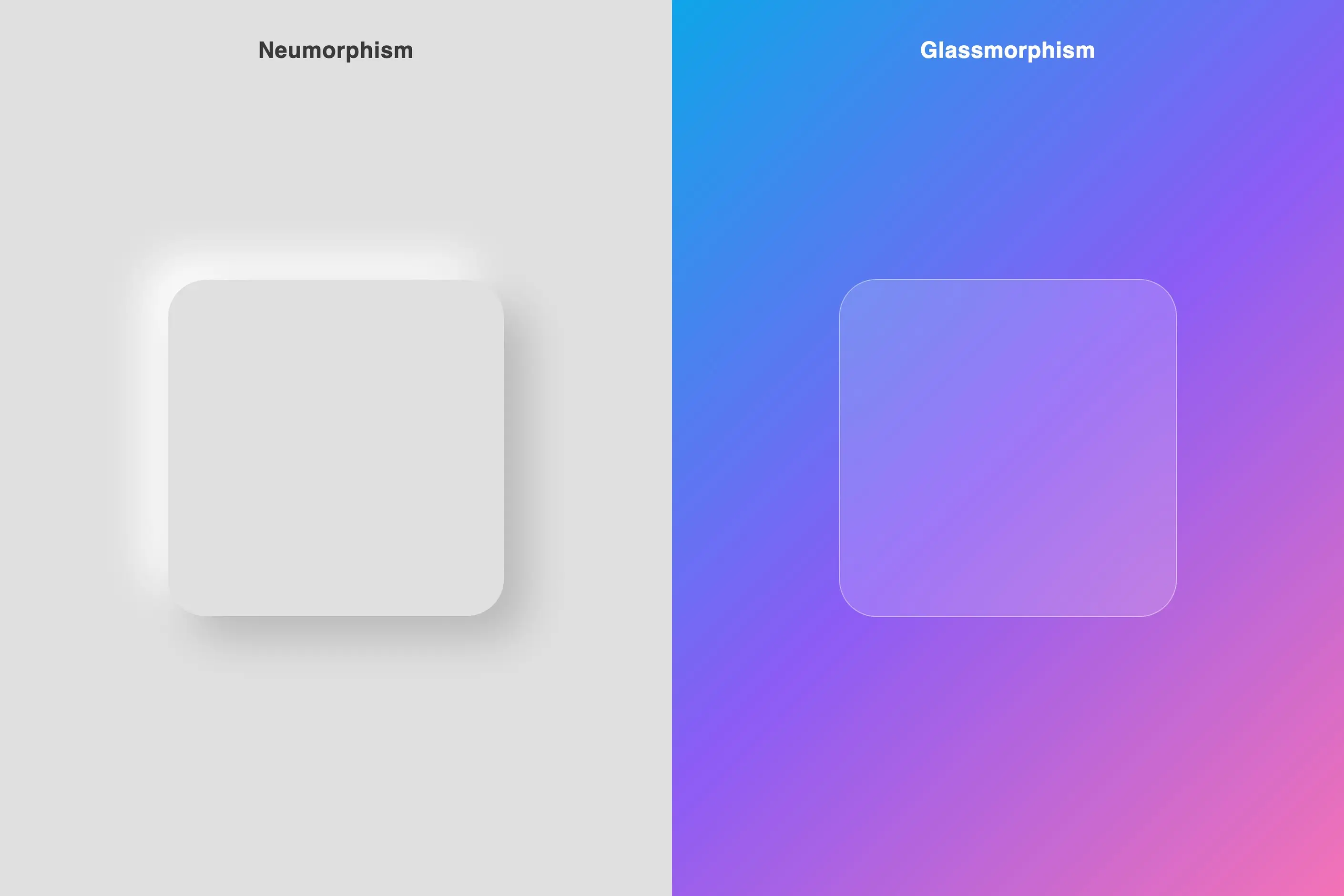
Glassmorphism renders interface panels as frosted glass: translucent surfaces that blur whatever sits behind them and let it show through as softened colour rather than hiding it behind a shadow.
It became a named web and platform trend around 2020, built on translucency techniques Apple and Microsoft had already shipped in their operating systems years earlier. Where neumorphism, its nearest sibling, carves depth out of a single-coloured surface using light and shadow alone, glassmorphism gets its depth from optical layering: you can see straight through it to what is behind.
a translucent, rounded panel that blurs a vivid background behind it, edged with a thin, light-coloured border and carrying little or no drop shadow. The colour comes from the background showing through, not from the panel itself.
Apple’s translucent macOS and iOS interfaces and Microsoft’s Windows Aero and Fluent Acrylic established backdrop blur as an interface technique well before glassmorphism became a named trend around 2020, when designers reached for depth again after years of flat design.
overlay surfaces that need to stay aware of what sits beneath them, modals, floating navigation, notification panels, decorative hero sections. Not buttons, forms, or dense data displays.
Frosted glass has a life outside computing. Architects and industrial designers have long used it to admit light while blocking a direct view, a combination that carries associations of privacy and refinement. Digital interfaces adopted the metaphor gradually, not all at once.
Apple built translucency into its operating systems long before glassmorphism had a name: the OS X translucent menu bar, iOS Control Centre, and the refined blur Apple shipped in macOS Big Sur all established the visual vocabulary. Microsoft arrived by a rockier route. Windows Vista’s Aero introduced translucent window chrome that revealed the desktop behind it and drew criticism for its performance overhead; Fluent Design’s Acrylic material later rebuilt the same idea for hardware that could carry it.
The trend took its current name around 2020, arriving partly as a reaction to years of flat design’s dominance. Designers wanted visual richness and depth back without giving up flat design’s clean foundations, and backdrop blur offered a way to add both without reintroducing skeuomorphic shadow.

| Element | What this style does | The tell |
|---|---|---|
| Colour | A vivid, multi-stop gradient or blurred image sits behind the panel; the glass itself carries a white or dark tint at roughly 10 to 40 per cent opacity | The colour comes from what is behind the glass, not from the glass |
| Form and shape | Rounded rectangles and simple geometric forms at generous size, typically a 12 to 24 pixel corner radius | Sharp corners or small elements break the glass illusion |
| Typography | Bold sans-serif set at high contrast, sometimes with a subtle text shadow | Type has to survive a background it does not control |
| Layout and composition | One glass surface visible at a time, set against solid surroundings, never glass stacked on glass | Contrast with opaque elements is what makes the glass legible |
| Materials and texture | Backdrop blur of roughly 20 to 60 pixels applied to the content behind the panel, plus a thin light-coloured border | backdrop-filter: blur() acting on the background, not a blurred panel edge |

| Neighbour | What it shares | What separates them |
|---|---|---|
| Neumorphism and soft UI | Both reintroduce depth after flat design’s dominance, and both favour soft, rounded forms | Neumorphism carves depth from a single-colour surface using light and shadow alone; glassmorphism gets depth from transparency, so the background genuinely shows through |
| Aurora gradients | Glassmorphism’s background layer is often exactly an aurora-style multi-stop gradient, and the two frequently appear together | Aurora gradients is the background treatment itself; glassmorphism is the transparent panel sitting on top of it. A page can use either without the other |
| Ethereal design | Both read as airy, soft and contemporary, leaning on colour and light over hard edges | Glassmorphism’s mechanism is specific and technical, backdrop blur simulating a physical material; ethereal design is a broader mood with no defined technique behind it |
Design the background layer before the glass. A gradient, a blurred photograph or a saturated colour field must carry enough visual variation for backdrop blur to register, or the panel reads as flat translucent grey rather than glass.
Set opacity and blur intensity together, never independently. Higher blur can compensate for lower opacity and lower blur needs higher opacity to hold the panel’s definition, so treat the two as one adjustable pair.
Reserve the effect for one surface at a time. A modal, a floating sidebar or a notification panel earns it; the content around that surface must stay solid, because the glass only reads against something opaque.
Keep buttons, form fields and every primary interactive control solid. A translucent button reads as ornament rather than affordance, and clickability must never be left to guesswork.
Add a thin, low-opacity light border to define the panel’s edge, and drop or minimise the shadow. Depth here comes from transparency, not elevation.
If the style is going into a design system, define it as a small, named set of tokens rather than free values: a handful of blur levels and matching opacity pairs, plus semantic components such as an elevated glass panel and a subtler variant, so every team applies the same glass rather than inventing one per screen.
Test the finished panel on the hardware it will ship to. Backdrop blur relies on GPU acceleration, and a large blurred area that feels instant on a development machine can stutter on a lower-powered device, particularly when the background behind it is animating.
Watch for pastiche. Glass laid over a muted or low-saturation background, or applied to every surface on a screen, signals a designer reaching for the look rather than the function.
Consider a solid fallback for older browsers and for users who choose a high-contrast or reduced-transparency setting. Safari needs the -webkit- prefix on backdrop-filter, and browsers without support should use a solid background colour rather than an unstyled, fully opaque block.
Glassmorphism’s central weakness is that its legibility depends on content it does not control. Text on a glass panel must meet contrast requirements against whatever happens to sit behind it as a user scrolls, not just the background it was tested against, and WCAG conformance has to hold in the worst case rather than the best.
The effect collapses fast into cliché. Applied to every surface on a screen, it stops signalling overlay status and becomes generic visual noise, because the technique only communicates something when solid elements surround it. A muted or low-contrast background produces a flat, muddy panel with none of the sophistication the style is chasing.
Backdrop blur is computationally expensive, and large blurred areas or animated content behind glass strain lower-powered devices. A glass interface that stutters on ordinary hardware has traded a visual effect for a real usability cost.
Because the technique reads as premium and current, people reach for it as decoration rather than function, applying it because it looks modern rather than because it signals hierarchy or overlay status. That is the difference between a design decision and a trend purchase.
Is glassmorphism the same as neumorphism? No. They are siblings that solved the same problem, flat design’s lack of depth, by opposite means. Neumorphism stays on a single-colour surface and builds depth from light and shadow; glassmorphism lets the background show through, so its depth depends on transparency rather than shading.
Why does glassmorphism fail contrast checks so often? Because the text sits on a panel whose apparent colour changes with whatever scrolls behind it. A contrast ratio that passes against one background state can fail against another, so conformance has to be checked against the worst case the panel might show, not a single screenshot.
How much blur and opacity is standard? Implementations typically apply 20 to 60 pixels of backdrop blur and hold the panel fills at 10 to 40 per cent opacity, adjusting the two together rather than separately. Lower blur with higher opacity keeps the panel defined; higher blur can carry a lower opacity.
Does it work on every browser? backdrop-filter has broad support in modern browsers but needs the -webkit- prefix for Safari, and older browsers need a solid-colour fallback rather than a broken transparent panel.
Is glassmorphism already dated? It has outgrown the trend-piece treatment it got around 2020 and is now a standard technique on major platforms, but it still fails fast when it is applied everywhere on a screen instead of to the one overlay surface that needs it.
| Fact | Detail |
|---|---|
| Named trend emerged | Around 2020, as a reaction to years of flat design |
| Core technique | CSS backdrop-filter: blur(), blurring content behind the panel rather than the panel itself |
| Pre-glassmorphism precedents | OS X’s translucent menu bar, Windows Vista’s Aero glass |
| Refined platform implementations | macOS Big Sur’s blur, iOS Control Center, Windows 11’s Fluent Acrylic |
| Typical backdrop blur | 20 to 60 pixels |
| Typical panel opacity | 10 to 40 per cent |
| Typical corner radius | 12 to 24 pixels |
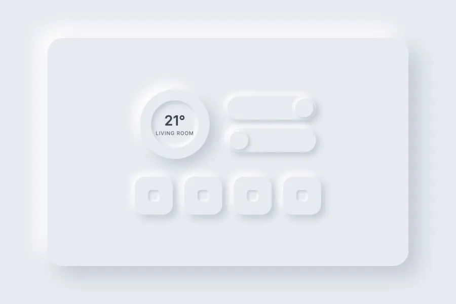
Neumorphism, or Soft UI, is a digital interface style that shapes buttons and panels as if they were moulded from the same continuous surface as their background, using two opposing soft shadows rather than colour or elevation to show whether an element rises or sinks.
Read it
Aurora gradients are a colour technique: three or more hues blended along curving, non-linear paths rather than interpolated in a straight two-colour fade, built to evoke the shifting curtains of the aurora borealis, cosmic nebulae or bioluminescent water.
Read it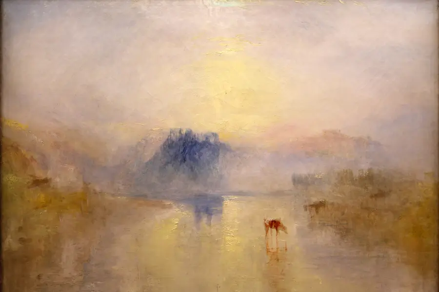
Ethereal design is a visual style built on pale, desaturated colour, translucent layered forms and diffused, blurred edges, so a composition reads as light rather than solid matter.
Read it
Flat design is a digital interface style that replaces the shadows, gradients and simulated materials of earlier interface design with solid colour, geometric form and typographic hierarchy.
Read it
Digital accessibility is the practice of building products people can use, whatever their permanent, temporary, or situational disability, measured against a published standard rather than opinion.
Read it
A design system is a governed set of reusable components, patterns and rules that a team uses to build consistent digital products at scale, and it is neither a static style guide nor a component library on its own.
Read it