
2026-09-15
Nural Choudhury
Chinese design principles are the visual and spatial conventions developed across successive dynasties of Chinese civilisation, from Bronze Age ritual bronzes through the fall of the Qing dynasty in 1912 and into contemporary China’s design industry.
They are organised around Confucian social hierarchy, Taoist and Buddhist cosmology, and a system of colour and motif in which most visual choices carry a specific, checkable meaning. The style is most often confused with Japanese design, and the line between them is direct: Chinese design uses colour, symmetry, and named motifs to signal status, fortune, and cosmic order, whereas Japanese design treats asymmetry, restraint, and the visible marks of age as the aesthetic itself.
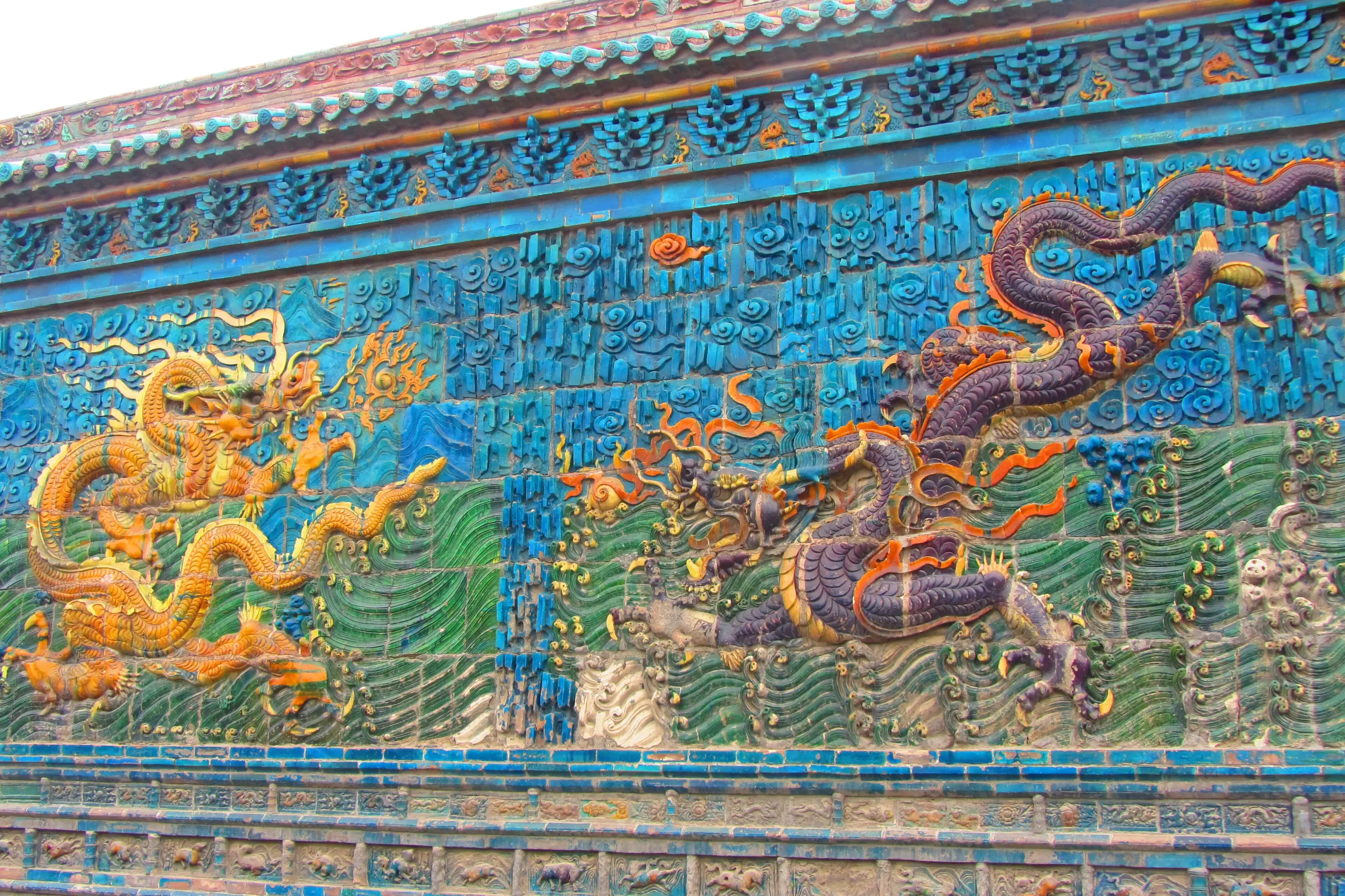
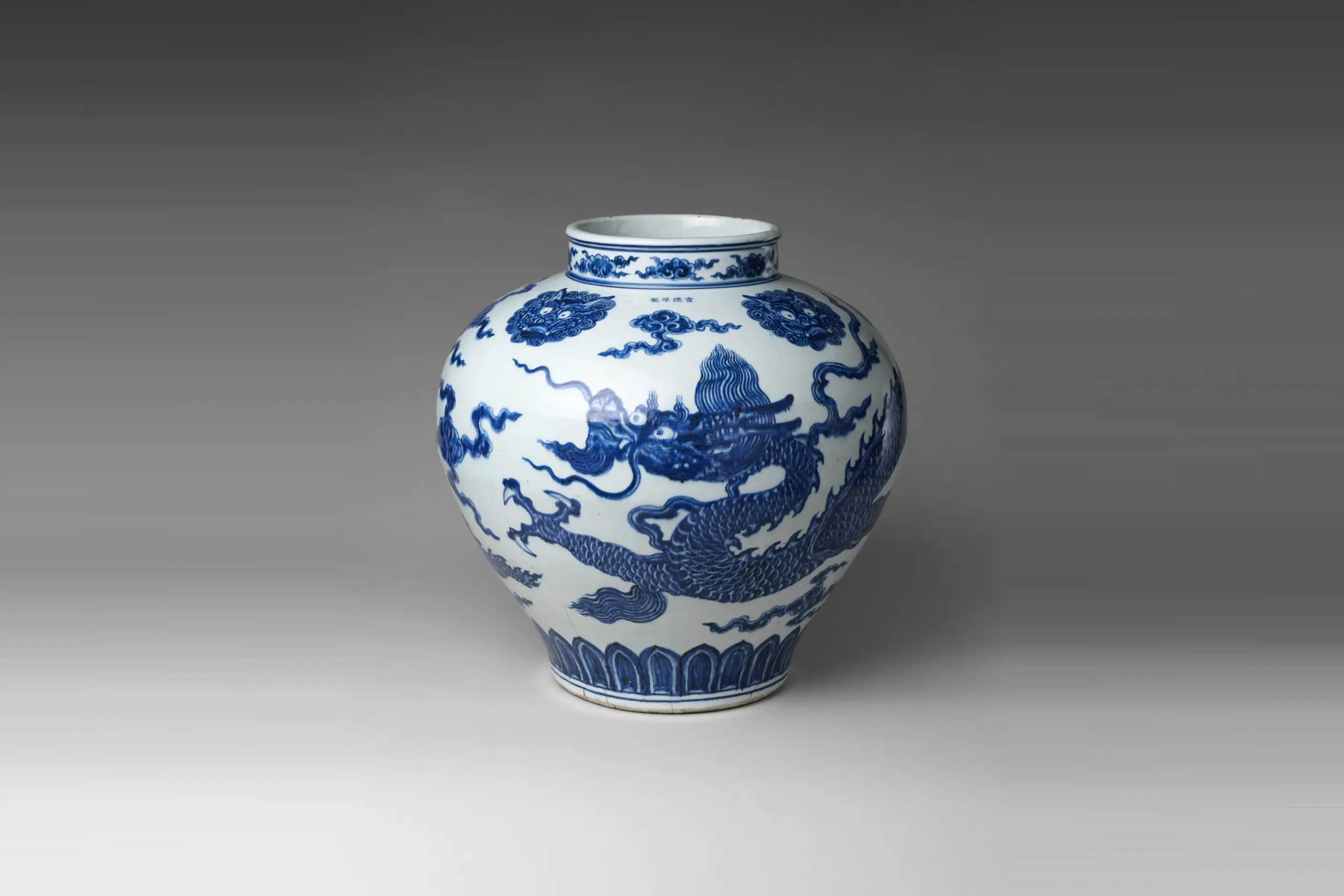
red and gold together, especially in celebration or commercial contexts; black used for depth and status rather than mourning, and white used for mourning rather than purity; a dragon or phoenix rendered with a specific number of claws or a specific pairing; strict axial symmetry in formal architecture set against asymmetrical “borrowed scenery” garden design; dense, repeating lattice, cloud, and scroll patterns filling a surface rather than isolating one motif in open space.
a continuous but interrupted tradition running from the Bronze Age Shang dynasty through the Zhou, Han, Tang, Song, Ming, and Qing dynasties, shaped by Confucian ritual order, Taoist cosmology, and Buddhism, and disrupted during the twentieth century before its ongoing revival.
work addressed to a Chinese or Chinese-literate audience specifically, festival and celebration design, and any context where you can name a motif’s actual meaning rather than borrow its silhouette.
Chinese design draws on three philosophical systems that took shape at different points across a long history. Confucianism and Taoism both trace to the Zhou dynasty, in the sixth century BCE, associated with Confucius and Laozi, and Buddhism reached China from India in the first century CE, during the Han dynasty. Each supplied a different logic: Confucian ritual propriety produced hierarchical, symmetrical space, Taoist harmony produced the deliberate asymmetry of garden design and the yin-yang framework for balance, and Buddhism supplied a specific symbolic vocabulary, the lotus chief among it, once it developed distinctively Chinese forms.
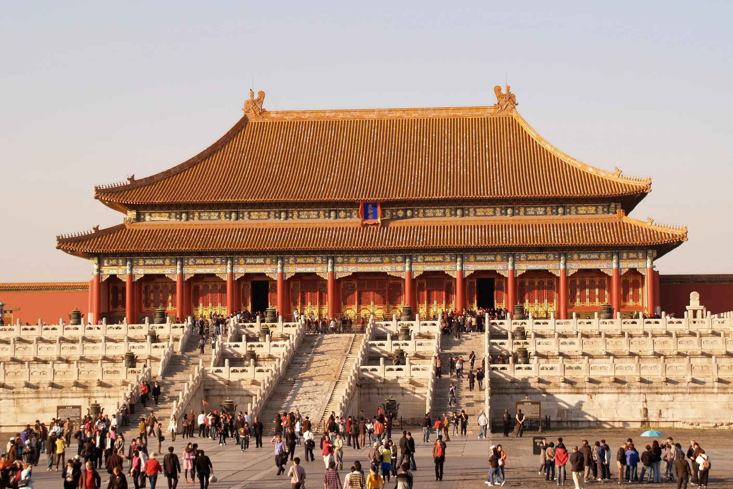
Much of the vocabulary a reader would recognise today was formalised, rather than invented, under the Ming and Qing dynasties, the last six centuries of imperial rule. The Forbidden City, completed under the Ming dynasty in 1420, set the template for axial planning, positioning a courtyard’s importance by its proximity to the central north-south line. Yellow and the five-clawed dragon were reserved for the emperor by law, with four claws and three claws marking descending rank below him.
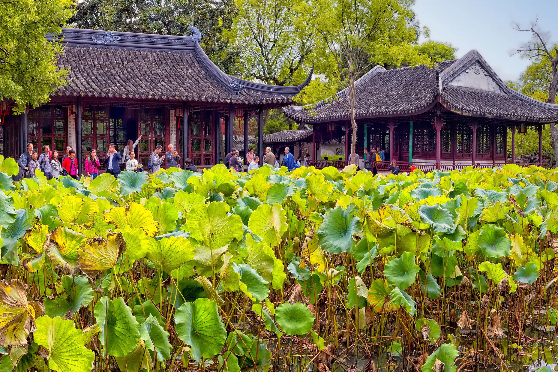
The classical gardens of Suzhou show the Taoist alternative to that formal symmetry. Developed mainly across the Ming and Qing dynasties and recognised by UNESCO as World Heritage, they arrange rock, water, and planting to suggest mountains and rivers in miniature rather than to impose geometric order. Where the Forbidden City states hierarchy, the Suzhou gardens state contemplation.
The twentieth century interrupted this transmission more than once. The Cultural Revolution, from 1966 to 1976, treated traditional and religious visual culture as one of the “four olds” to be destroyed, and the training lines that had carried scripts, motifs, and craft techniques for generations broke along with the workshops that closed. Design in China since has negotiated between reviving that heritage and building an industry that competes on its own terms, from calligraphic branding to the dense, red-dominant interfaces of platforms such as WeChat and Taobao.
| Element | What this style does | The tell |
|---|---|---|
| Colour | Red signals luck, celebration, and prosperity. Gold and imperial yellow signal wealth and, historically, the emperor alone. Black signals depth, wisdom, and career rather than mourning, and white signals mourning rather than purity | White reads as loss, not cleanliness, so a red invitation and a white one are doing opposite jobs |
| Form and shape | Formal and ceremonial buildings use strict axial symmetry to express Confucian hierarchy. Garden design uses deliberate asymmetry and “borrowed scenery” to express Taoist naturalism | The same tradition holds a rigid formal mode and a loose naturalistic mode side by side, and the context tells you which applies |
| Script and lettering | Characters carry meaning as image as well as language. Formal scripts such as seal, clerical, and regular signal authority and permanence, and cursive scripts such as running and grass signal personal expression | Choosing a script register is the equivalent, in Chinese design, of a Western designer choosing a typeface weight |
| Layout and composition | Feng shui’s bagua zoning and attention to qi flow organise movement and hierarchy before symmetry is applied. Paths curve, and entries stage rather than confront | A threshold rarely runs straight at an entrance; the route in is deliberately interrupted or redirected |
| Pattern and material | Lattice and fretwork, known as chuanghua in window screens, turn simple geometric units into dense surfaces. Wave, cloud, and floral scrollwork fill a surface rather than isolate a motif | Pattern density across the whole surface, not a single motif floating in open space, is the default |
| Imagery and motif | The dragon signals masculine, imperial power, the phoenix feminine renewal, the lotus Buddhist purity, bats fortune through a homophone with 福, and clouds and the endless knot signal auspiciousness and continuity | A motif that reads as generic decoration outside China usually has a specific owner and occasion inside it |
| Neighbour | What it shares | What separates them |
|---|---|---|
| Japanese design philosophy | Roots in Buddhism, the brush arts, and a garden tradition that arranges rather than imposes on nature | Chinese design uses colour and motif to signal status, fortune, and cosmic hierarchy. Japanese design, through wabi-sabi and ma, treats imperfection, asymmetry, and the passage of time as the aesthetic centre, largely without a comparable colour-symbolism system |
| Korean design movement | Confucian social structuring, a shared brush-and-character heritage, and a five-colour cosmological palette on both sides | Korea developed hangul, a purpose-built phonetic alphabet unrelated in structure to Chinese characters, and its contemporary design identity runs through an export-facing creative industry rather than an unbroken imperial court tradition |
| Calligraphy traditions | The brush, the ink, and the status of writing as art | Calligraphy traditions compares the tool, script, and training discipline of Chinese, Japanese, Arabic, and Western hands against each other. Calligraphy sits within the wider Chinese system of colour, motif, feng shui, and architecture as one element among several |
Establish the audience and context before you choose a single colour. You must know whether red, white or black will read as festive or as mourning to the people who will see the work, because the two readings are opposite and a mistake here is not a matter of taste.
Match the register of any Chinese script you use to the job. Formal, regular script signals permanence and authority, and running or cursive script signals warmth and a personal touch. You must not distort or invent characters to fit a grid: a malformed character reads as illiterate to anyone who can read it, not as stylish.
Where a motif carries a historical status marker, such as the five-clawed dragon or imperial yellow, treat that history as part of the brief rather than decoration to ignore. Use it where the status claim is genuinely intended, and leave it out where it is not.
If you apply feng shui or bagua thinking to a spatial or interface layout, treat qi flow as a literal description of how attention and movement travel through the space, and design the path, not only the colour scheme. Combining red, gold, a dragon, and a seal-style graphic without understanding what any one of them communicates on its own is the fastest route to the pastiche covered next.
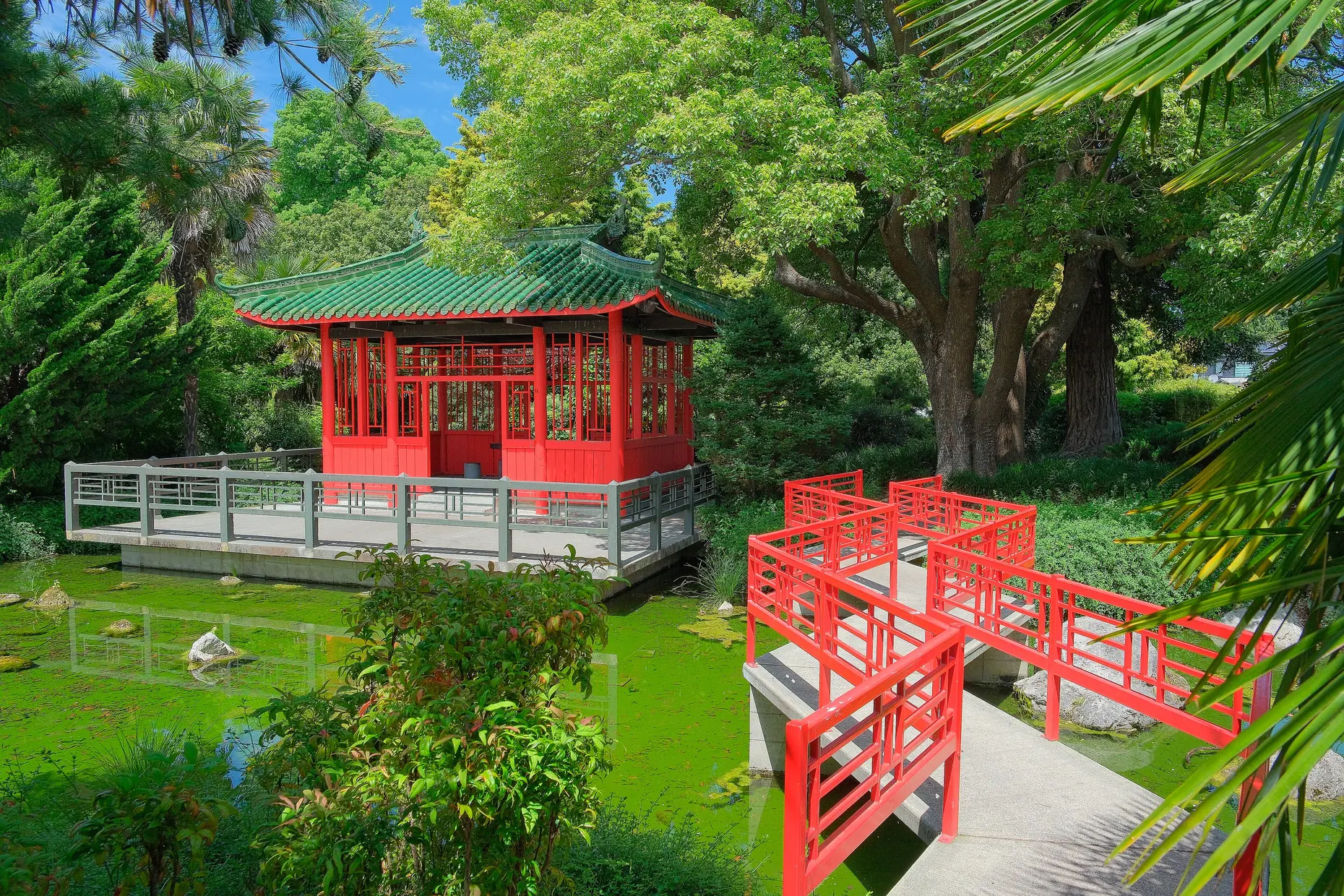
The most common failure is treating five thousand years of dynastic history as one undifferentiated mood: red lanterns, a generic dragon, and brush-stroke lettering standing in for “China” regardless of period, region or occasion. That flattening is itself the problem this section exists to name, not a lesser version of it.
Status markers with real historical weight get reused as decoration with the weight removed. The five-clawed dragon and imperial yellow were restricted by law to the emperor. Applying either as a generic premium or “Asian” signal on packaging or branding borrows a symbol of enforced hierarchy and empties it of the hierarchy that gave it meaning.
Latin lettering dressed with brush-stroke serifs to signal “Chinese,” the style sometimes called chop suey or wonton lettering, was created by a Western foundry in 1883, not by Chinese calligraphers. It mimics two Chinese calligraphic strokes while ignoring the script’s actual structure, and it has since been used to stoke stereotypes and outright xenophobia in advertising and political attack material. The difference between a reference and a costume is whether the borrowing can explain, specifically, what it is borrowing and why.
Feng shui itself fails when it is applied as decorative mysticism: a bagua diagram pasted onto a floor plan without understanding what each zone is meant to support is the same shallow use the whole tradition risks when reduced to a mood board.
Is feng shui just interior design? No. Feng shui is a spatial and cosmological system that integrates qi flow, the eight-direction bagua map, and the balance of the five elements, developed to arrange buildings and rooms for wellbeing rather than appearance alone. It is reasonable to treat its attention to light, circulation, and balance as sound spatial thinking while treating the qi-flow claims themselves as a matter of belief rather than physics.
Why is white for mourning and red for celebration, the opposite of the Western convention? Because the two colour systems developed independently and assign meaning by different logic. Red signals luck and life in the Chinese system, and white, in traditional use, signals the absence of colour and life associated with funerals. A colour choice that reads as clean or fresh for one audience can read as loss for another, so audience matters more than instinct.
What separates Chinese design from Japanese design in practice? Colour and hierarchy. Chinese design uses a defined system of colour and motif meaning tied to status, fortune, and cosmic order, and builds formal spaces on strict symmetry. In contrast, Japanese design treats asymmetry, restraint, and the visible marks of age as the aesthetic itself, without a comparable colour-symbolism system. The shared Buddhist and brush-art roots make the two easy to conflate, but the organising logic differs.
Is it acceptable to use a dragon or the colour red for a brand with no connection to China? It depends on whether the choice can explain itself. Red used because it tests well and reads as festive is a colour decision like any other. Still, a five-clawed dragon, historically an imperial status marker, or a motif with a specific religious meaning used purely as generic “Asian” decoration is the costume version of the same borrowing. The difference is whether the choice can be defended by the motif’s actual meaning rather than its silhouette.
| Fact | Detail |
|---|---|
| Philosophical roots | Confucianism and Taoism, Zhou dynasty, sixth century BCE, associated with Confucius and Laozi |
| Buddhism reaches China | First century CE, during the Han dynasty, from India |
| Forbidden City | Completed under the Ming dynasty, 1420 |
| Suzhou classical gardens | Developed mainly across the Ming and Qing dynasties, recognised by UNESCO as World Heritage |
| Imperial colour and motif law | Yellow and the five-clawed dragon reserved for the emperor, enforced under the Ming and Qing |
| Script chronology | Seal script from the Qin dynasty’s unification, 221 BCE; clerical script, Han dynasty; regular script, standardised by the Tang dynasty |
| Twentieth-century disruption | Cultural Revolution, 1966 to 1976, suppressed traditional and religious visual culture as one of the “four olds” |
| End of imperial rule | Qing dynasty falls, 1912 |

Japanese design philosophy names a group of aesthetic concepts, among them wabi-sabi, ma, kanso, shizen, and yugen, developed over centuries in Zen Buddhist and Shinto practice and applied to ceramics, gardens, architecture, and graphic design.
Read it
Korean design covers two different things: a historical visual tradition, shaped over centuries by Confucian, Buddhist and shamanist thought and expressed through celadon and buncheong ceramics, hanok architecture and hanbok textiles, and a contemporary design industry, built since the 1990s by South Korean electronics, beauty and entertainment companies and marketed abroad as “K-Design” alongside K-pop and K-drama.
Read it
Calligraphy is the practice of beautiful handwriting: letters formed in one continuous, tool-determined stroke rather than built up through repeated passes.
Read it
Islamic design traditions are interlinked visual systems (geometric patterns, calligraphy, and arabesques) that developed over fourteen centuries and across three continents, from Spain to Indonesia.
Read it
Sacred geometry treats certain geometric forms and proportions, among them the golden ratio, the Platonic solids, and the Flower of Life, as evidence of a divine or cosmic order laid over mathematics that is otherwise plain and checkable.
Read it
Colour theory is the study of how colours relate to each other on the wheel, across value, saturation, and temperature, and in combination so that you can reason through a decision rather than feel it.
Read it