

2026-09-15
Nural Choudhury
Japanese design philosophy names a group of aesthetic concepts, among them wabi-sabi, ma, kanso, shizen, and yugen, developed over centuries in Zen Buddhist and Shinto practice and applied to ceramics, gardens, architecture, and graphic design.
Each concept governs a different kind of restraint, from the imperfect glaze on a tea bowl to the ordering of silence in a room, rather than describing one fixed look. Scandinavian design and Japanese design are both routinely reduced to “minimalist”, and neither one is: Scandinavian design plans away the maker’s hand in pursuit of an efficient, repeatable object, while Japanese design keeps the crack, the asymmetry, and the evidence of use as the point.
asymmetric compositions and irregular, hand-worked forms; unfinished or aged surfaces treated as features rather than flaws; generous unfilled space around a small number of elements; a muted, natural palette of wood, stone, paper, and indigo; and a reluctance to state everything outright.
Zen Buddhism, which reached Japan from China in the twelfth century, and Shinto’s older reverence for natural materials and seasonal change, worked out over centuries through the tea ceremony, garden design, ceramics, and ikebana.
objects and interfaces that need to feel considered rather than decorated, where restraint, pacing, and material quality carry more meaning than content density or ornament.
Zen Buddhism reached Japan from China in the twelfth century and developed distinctively Japanese forms there. It emphasises direct experience over intellectual understanding and treats impermanence as a basic fact rather than a problem to solve. Zen monastic practice turned garden design, tea ceremony, calligraphy, and flower arrangement into spiritual disciplines, not merely decorative crafts.
Wabi-sabi is the concept that has travelled furthest outside Japan, and it names beauty found in imperfection, impermanence, and incompleteness. The word joins wabi, which originally meant the melancholy of solitude and now suggests rustic simplicity, with sabi, the beauty that age and wear leave behind, such as a patina on metal or moss colonising stone. A hand-thrown bowl with an irregular rim, or a wooden surface marked by use, carries wabi-sabi beauty precisely because it is not perfect.
Shinto, Japan’s indigenous tradition, recognises sacred presence, kami, in mountains, rivers, trees, and stones, which shaped an approach to nature as something to work with rather than master. Natural materials are used honestly, ageing and weathering are accepted rather than resisted, and the seasons structure much of the visual calendar. Mono no aware, “the pathos of things”, names the bittersweet pleasure taken in something beautiful because it will not last, the standard example being cherry blossoms that bloom fully and fall within days.
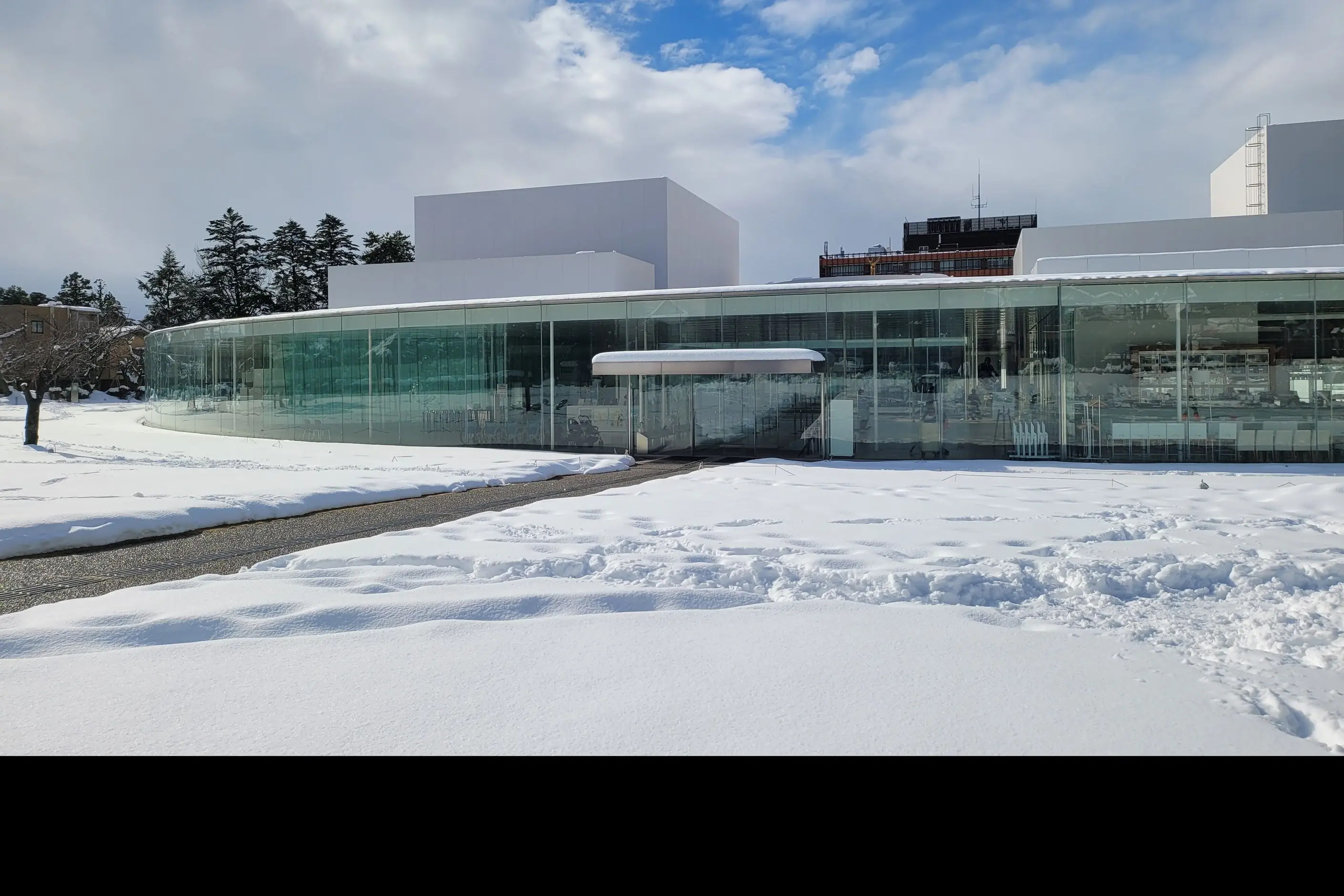
Ma is usually translated as negative space, pause, or interval, though the translation understates it: ma treats emptiness as an active presence rather than an absence waiting to be filled. The space between two objects on a shelf, or the silence between two notes, carries as much design weight as the objects or notes themselves. In composition, this shows up as generous margins, a small number of elements each doing real work, and areas left open on purpose.
Kanso is simplicity achieved by removing rather than adding, and it differs from a minimalist look pursued for its own sake: kanso asks what can be taken away, not what looks empty. Shizen means naturalness: the appearance of having arrived without effort, even when the underlying craft required a great deal of it. Yugen names a suggestive, unresolved beauty, the depth implied by a landscape half hidden in mist rather than the same landscape fully shown.
These concepts built specific practices rather than staying abstract. The tea ceremony, chado, took shape in the sixteenth century under the tea master Sen no Rikyu, who favoured rustic materials and worn objects over refinement. He built tea houses of deliberate modesty, entered through a low door that makes every guest stoop.
Japanese garden design carries the same restraint into landscape. The dry karesansui gardens of Zen temples suggest water and mountains using raked gravel and placed stone rather than either. The technique of shakkei borrows distant scenery beyond the garden’s own boundary to extend the design past its physical limit. Ikebana, the practice of flower arrangement, uses far fewer stems than a typical Western arrangement and treats a cut flower’s short life as part of its beauty rather than something to disguise.
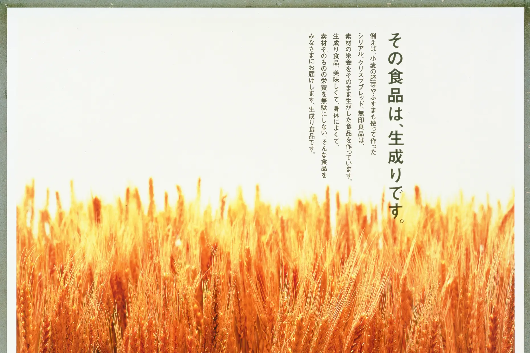
The philosophy is carried into commercial design most visibly through Muji, founded in 1980 as Mujirushi Ryohin (“no-brand quality goods”), which applies kanso and shizen to household goods with no logos and muted, unbranded packaging. Muji’s art director Kenya Hara has written about emptiness and material texture, notably in his book White and his 2002 Haptic exhibition. The industrial designer Naoto Fukasawa developed mu-ishiki, “without thought” design intended to be intuitive enough to use without conscious attention.
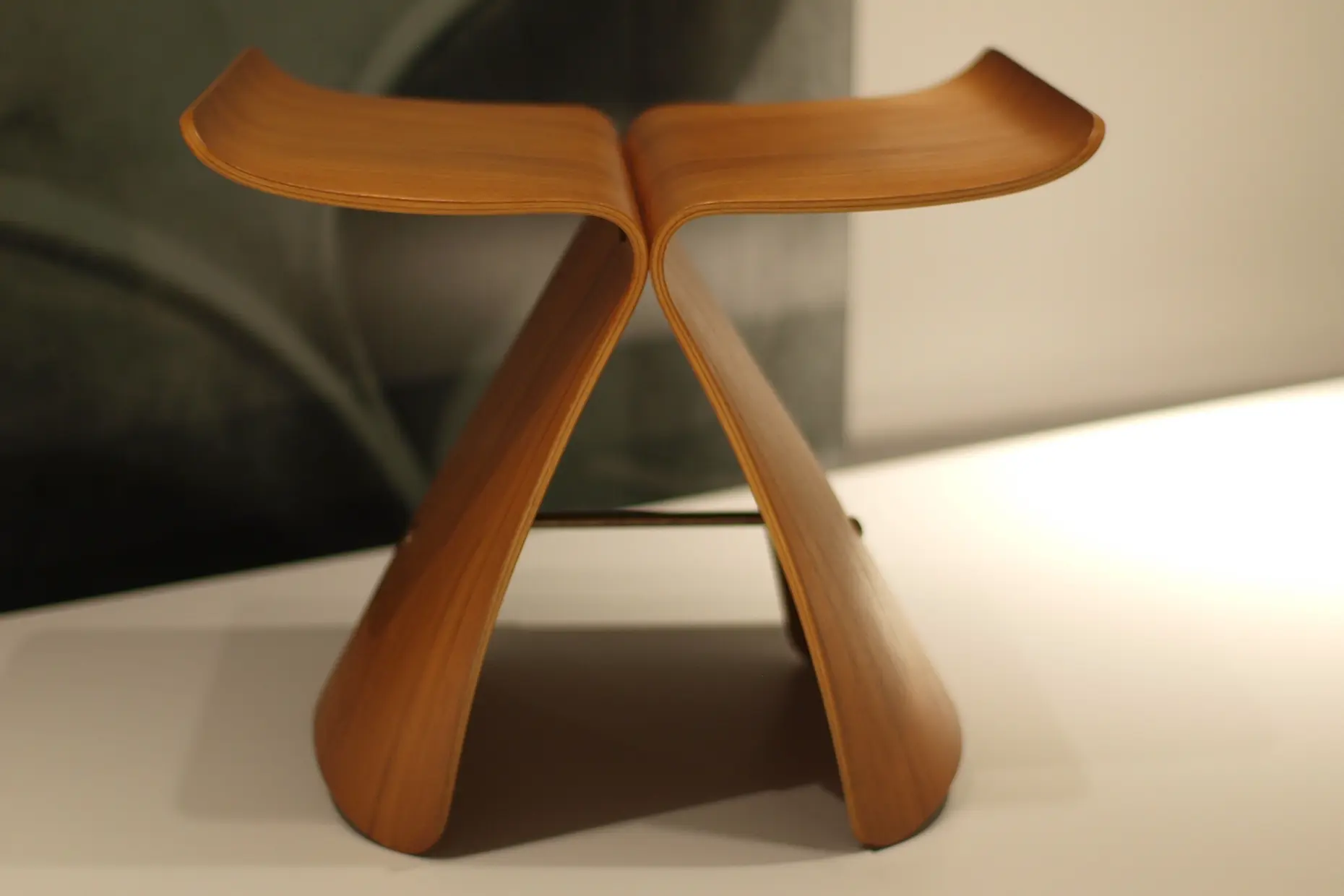
| Element | What this style does | The tell |
|---|---|---|
| Colour | A muted, desaturated palette drawn from natural material rather than pigment: indigo, charcoal, unbleached paper, and wood tones, with black or a single deep red used sparingly | A swatch reads as a material, paper, ash, indigo dye, rather than as a flat colour value |
| Form and shape | Asymmetric composition and irregular, hand-worked outlines rather than mirror symmetry | An object sits off-centre in a wide field of open space rather than in a balanced, centred arrangement |
| Typography | Restrained type in one weight, generous line spacing, and script conventions that treat surrounding space as part of the letterform | White space between lines and characters is composed, not filled to the margin |
| Layout and composition | A small number of elements, each justified by necessity, arranged with wide unfilled space around them (ma) | The layout reads as incomplete by Western standards, because the emptiness is doing work rather than waiting to be filled |
| Materials and texture | Natural, honestly finished materials, wood, stone, paper, and ceramic, allowed to age, weather, and show wear (wabi-sabi) | Visible grain, a kept patina, or an irregular glaze, rather than a surface sanded or corrected back to uniformity |
| Imagery and ornament | Suggestion over statement: obscured or partial views, seasonal reference, and motifs that imply more than they show (yugen) | An image or object reveals itself gradually, through mist, a screen, or a sequence, rather than all at once |
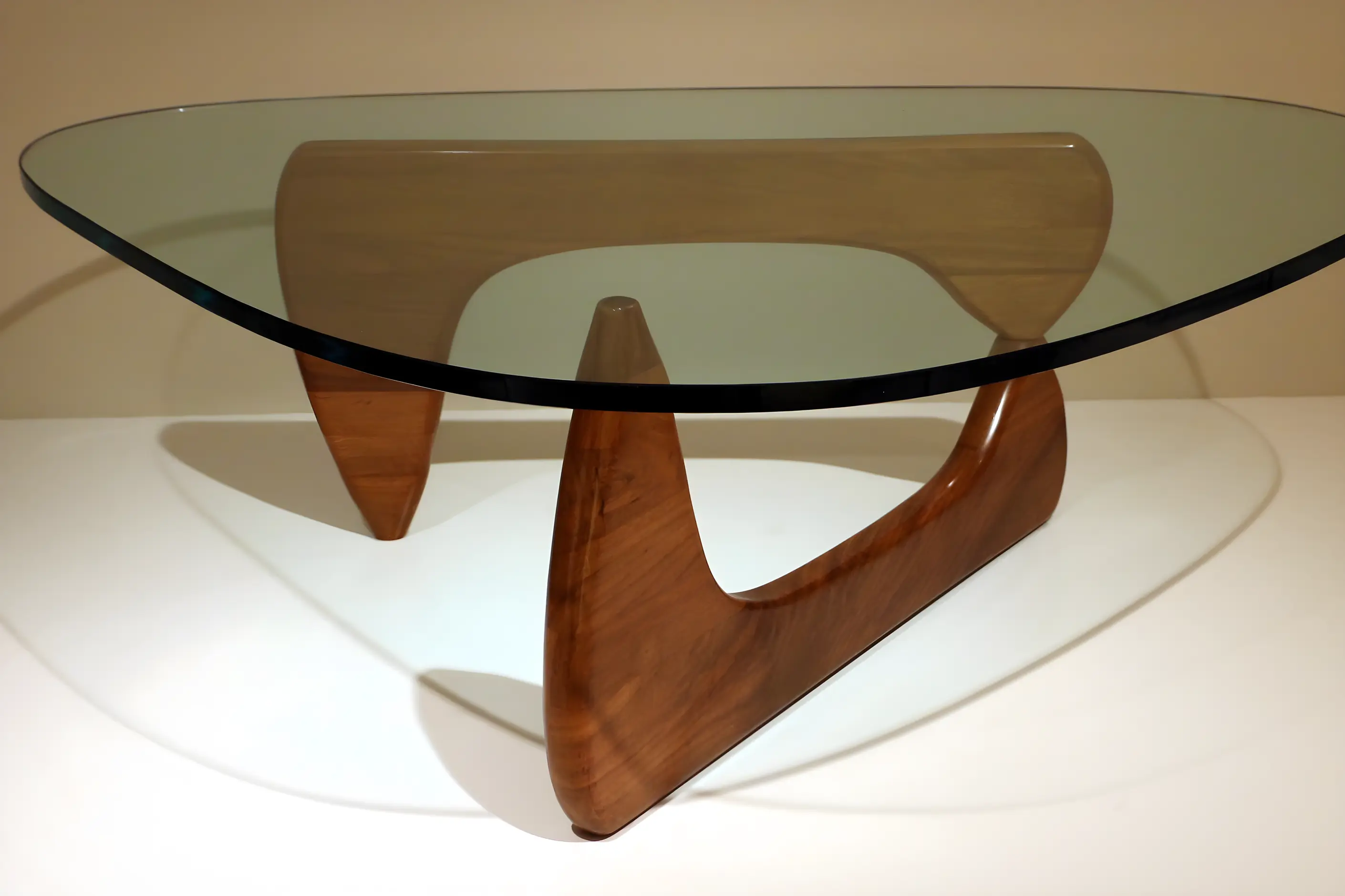
| Neighbour | What it shares | What separates them |
|---|---|---|
| Scandinavian design philosophy | Both are reduced to “minimalist” in casual use, and both value restraint and natural materials over ornament | Japanese restraint rests on an aesthetic and philosophical tradition concerned with imperfection, asymmetry, and the deliberate use of empty space. Scandinavian restraint rests on a political and economic argument about affordability and mass production, expressed through pale wood and light colour rather than void or irregularity |
| Korean design movement | East Asian visual roots and, at points, shared exposure to Buddhist practice and brush-based art | Japanese design’s contemporary vocabulary grew continuously out of Zen-inflected craft and tea culture. Korean design separates its own historical craft lineage from a fast-moving, export-driven contemporary design and branding industry operating on a different commercial timescale |
| Chinese design principles | A historical link through Buddhism, since the Zen Buddhism that shaped Japanese aesthetics reached Japan from China in the twelfth century, and both traditions treat brushwork and restraint in ink and space with care | Chinese design draws on a much longer, continuous imperial history across many dynasties, and its state and religious contexts favour symmetry and rich ornament. Japan’s more austere, asymmetric aesthetic developed later, at a smaller domestic scale, and it refined ideas imported from China through a monastic, Zen lens |
Cut before you add. Remove elements until each one remaining earns its place, in the spirit of kanso, and treat that editing as the main design work rather than a finishing pass.
Treat space as a decision, not a leftover. Size margins and gaps deliberately, in the spirit of ma, and resist filling a layout to the edge just because room remains.
Build compositions on asymmetric balance. Weight elements against each other rather than mirroring them, and let a single strong element sit off-centre in a wide field of space rather than centring it.
Choose materials that age well where the object or interface will be used over time, and let ageing show. A patina, a worn edge, or an irregular glaze is evidence of wabi-sabi, not a defect to correct.
Suggest rather than state everything a user or viewer could work out for themselves. In interfaces, this means leaving room for a reader to complete an idea; in objects, it means a form that reveals itself gradually rather than all at once, in the spirit of yugen.
Ground every borrowed motif in an actual reduction of content and material. A cherry blossom graphic, red-and-black palette, or a torii-shaped accent added to an otherwise dense, symmetrical layout produces pastiche, not style, because the vocabulary only works once the underlying editing has happened.
“Zen” has become marketing shorthand for a calm, neutral palette: a stock photograph of raked gravel and a bamboo stalk used to signal wellness with none of the restraint, asymmetry, or actual editing the concepts describe. This is the cliché the page has argued against throughout: using the vocabulary as decoration rather than doing the reduction that makes the vocabulary meaningful.
Wabi-sabi collapses in a related way when it is sold as a finish: deliberately distressed ceramics or furniture, mass-produced to look handmade and priced at a premium for the appearance of imperfection. The concept describes a relationship to time and material developed through use, not a texture applied to a new object at the factory.
Appropriation belongs here stated directly, not gestured at. Kanji is a living script, and using Japanese characters decoratively without understanding their meaning treats a language as ornament and risks real embarrassment or offence. The tea ceremony, Zen temple forms, and Shinto symbols such as the torii gate carry specific religious and ceremonial meaning, and lifting them into a “Japanese-inspired” interior or a generic Asian-coded logo strips that meaning out.
A reference studies the underlying discipline, what was removed to reach this form, and applies that discipline to a new problem. A costume borrows the surface, the red lacquer, the kanji, the torii silhouette, and stops there.
The style also carries a real risk of collapsing into “Japandi”, a recent commercial blend of Japanese and Scandinavian vocabulary that can flatten two distinct philosophies, one rooted in Zen Buddhism and Shinto, the other in Nordic social-democratic politics, into a single beige palette. Naming which tradition a given decision comes from, rather than treating both as interchangeable calm minimalism, is what keeps the borrowing honest.

Is Japanese design the same as minimalism? No. Minimalism, as a Western movement, pursues reduction as an aesthetic in its own right, and a strict minimalist palette often removes texture to reach a clean surface. Kanso reduces the non-essential while keeping what remains meaningful, and wabi-sabi keeps the texture, asymmetry, and signs of age that minimalism would remove.
What is the difference between ma and negative space as Western design education usually teaches it? Western design education often treats space as background, a neutral field the real content sits on. Ma treats the empty area as a designed element carrying its own weight, comparable to the elements around it, so margins and gaps are sized as deliberately as the objects they surround rather than filled in afterwards to look finished.
Is “Japandi” an authentic combination of two traditions? It is a recent marketing term for interiors that pair light Scandinavian wood with Japanese-coded restraint, and it functions as a commercial blend rather than either tradition practised on its own terms. Used carelessly, it collapses two philosophies with different histories into a shared beige palette, so naming which tradition a decision comes from keeps the comparison useful.
Do I need to understand Zen Buddhism to use these ideas? Not to apply the visible vocabulary: an asymmetric layout or a generous margin does not require religious commitment. Recognising the depth behind the concepts keeps their use from becoming decorative borrowing, since understanding why ma or wabi-sabi exists changes how carefully a designer applies it.
What does mono no aware describe? Mono no aware describes the bittersweet pleasure taken in something beautiful because it will not last; the standard example is a cherry blossom that blooms fully and falls within days. It differs from ordinary sadness because transience is part of what makes the thing beautiful rather than a flaw; a design that ages visibly and develops patina, rather than one that merely looks worn out, can carry the same quality.

| Fact | Detail |
|---|---|
| Zen Buddhism reaches Japan | Twelfth century, arriving from China and developing distinctively Japanese forms |
| Core concepts | Wabi-sabi, ma, kanso, shizen, yugen, and mono no aware |
| Tea ceremony formalised | Sixteenth century, associated with the tea master Sen no Rikyu |
| Key practices | Chado (tea ceremony), karesansui and stroll gardens, ikebana |
| Muji founded | 1980, as Mujirushi Ryohin (“no-brand quality goods”) |
| Kenya Hara, Haptic exhibition and White | 2002 |
| Naoto Fukasawa’s mu-ishiki (“without thought”) design | Late twentieth century onward |

Minimalism in design reduces a composition to the elements it cannot function without, so colour, form, type, and space each carry more weight because there is less to look at.
Read it
Scandinavian design is a modernist design philosophy that developed across Denmark, Sweden, Norway, Finland, and Iceland from the early twentieth century, based on the idea that good design is a public good, not a private luxury.
Read it
Korean design covers two different things: a historical visual tradition, shaped over centuries by Confucian, Buddhist and shamanist thought and expressed through celadon and buncheong ceramics, hanok architecture and hanbok textiles, and a contemporary design industry, built since the 1990s by South Korean electronics, beauty and entertainment companies and marketed abroad as “K-Design” alongside K-pop and K-drama.
Read it
Chinese design principles are the visual and spatial conventions developed across successive dynasties of Chinese civilisation, from Bronze Age ritual bronzes through the fall of the Qing dynasty in 1912 and into contemporary China’s design industry.
Read it
Mid-century modern design describes the wave of modernist furniture, architecture and graphic design that flourished across the United States and Scandinavia from roughly 1933 to 1965, when Bauhaus rigour met American industrial optimism and Scandinavian craft.
Read it
The Arts and Crafts movement is a design and social reform movement that began in Britain in the second half of the nineteenth century, built around dense botanical patterns, honest materials and visible handcraft, as a direct reaction against industrial factory production.
Read it
Biophilic design is the practice of bringing patterns of the natural world into architecture, interiors, and digital products: daylight, water, plants, natural materials, and spatial variety, because human beings evolved among those patterns and still respond to them.
Read it