

2026-09-15
Nural Choudhury
Ethereal design is a visual style built on pale, desaturated colour, translucent layered forms and diffused, blurred edges, so a composition reads as light rather than solid matter.
It appears across wedding photography, wellness branding, fine art light installations and digital interfaces wherever a brief calls for an elevated, dreamlike register. Glassmorphism, its closest neighbour, is one specific technical device, backdrop blur on a single interface panel; ethereal design is the broader visual mood that technique borrows atmosphere from, and it has no comparable technical spine of its own.
near-white colour (soft blue, blush pink, lavender, dove grey, pale cream), layered translucent forms rather than solid blocks, edges softened by gradient or blur rather than cut with a hard line, and a composition with nothing resting on a ground line: forms float, drift or hang free instead of sitting.
no single founding date or school. The look draws on religious art’s gold-ground light (medieval illumination, Byzantine icons), Romantic landscape painting, and Pictorialist soft-focus photography, carried into a contemporary commercial and digital vocabulary from the 1990s onward.
wellness and meditation branding, bridal and fine-art photography, premium beauty and fragrance packaging, and digital surfaces such as loading states and meditation-app interfaces. Not for corporate, transactional or dense-data work, where the softness reads as a lack of clarity rather than elevation.
Medieval manuscript illumination used gold leaf against dark grounds. As a result, a sacred text appeared to emit its own light, and Byzantine icon painters used gold backgrounds and flattened, elongated figures to suggest a spiritual rather than physical presence. Renaissance painters such as Fra Angelico and Perugino extended the device into soft, diffused celestial light, and Baroque painters including Vermeer and Georges de La Tour turned candlelight and window light into a subject in its own right.
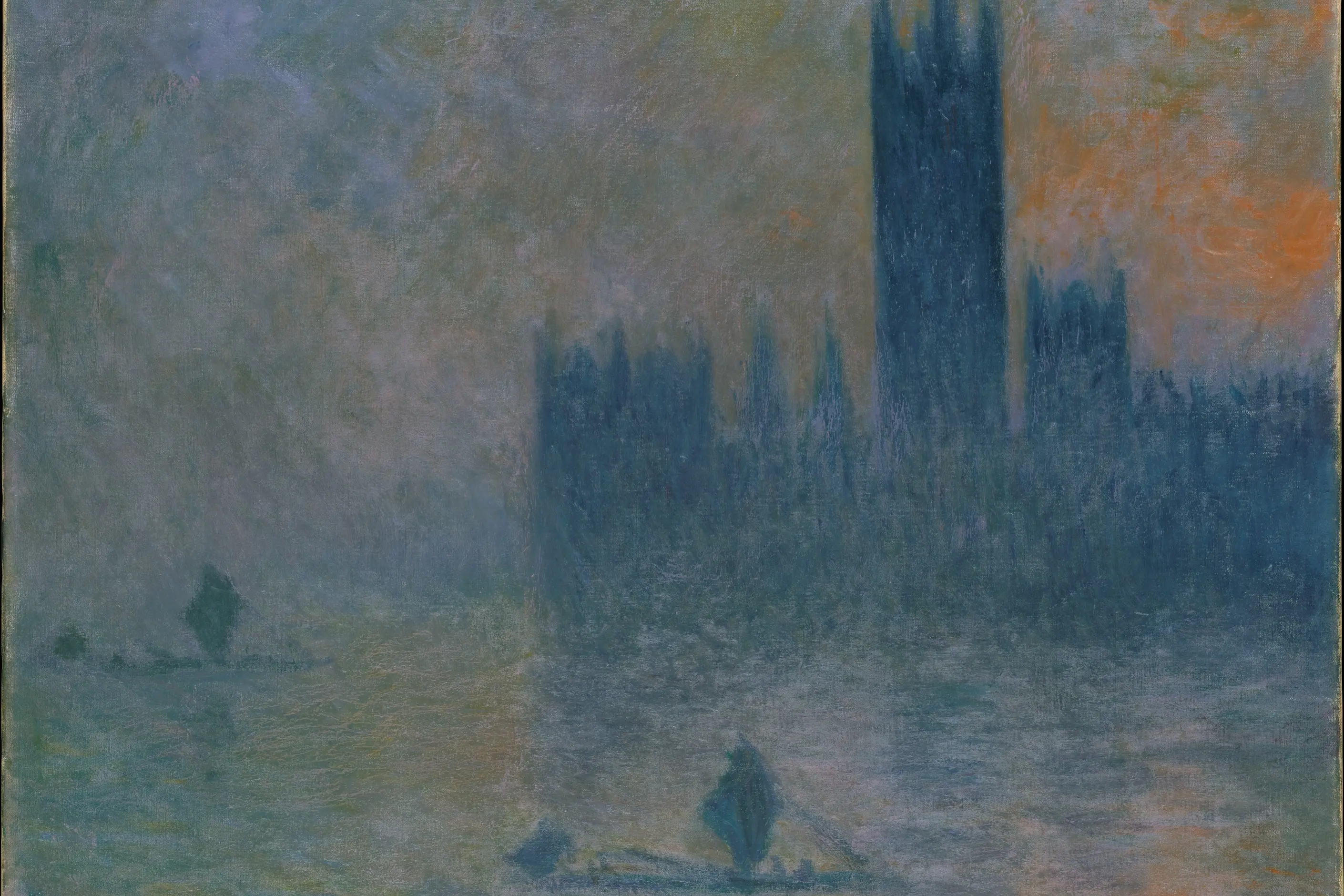
Romantic philosophy distinguished beauty, which pleases, from the sublime, which overwhelms, and that distinction gave landscape painters a reason to dissolve solid form into scale and light. J.M.W. Turner dissolved matter into mist and light in his late landscapes, and Caspar David Friedrich set small human figures against vast, luminous skies. Nineteenth-century American Luminist painters and the Impressionists, Monet’s misty mornings and Whistler’s nocturnes among them, carried the same interest in atmosphere over solid form into landscape and everyday scenes.
Pictorialism, an early art-photography movement, used soft focus and painterly manipulation in place of documentary sharpness, and fashion photography picked up a related soft-focus, pale-palette language from the 1990s onward. In gallery practice, artists including James Turrell, Olafur Eliasson and Dan Flavin have built installations from light and mist itself rather than depicting it, a direct ancestor of the style’s treatment of light as subject rather than illumination.
“Ethereal design” names none of these movements. It is a label the branding, wellness and wedding industries apply retrospectively to work that borrows this visual language, so there is no founding designer, studio or manifesto to cite, only the sources its vocabulary comes from.

| Element | What this style does | The tell |
|---|---|---|
| Colour | Near-white value range: soft blues, blush pinks, lavenders, dove greys, pale creams, saturation kept low, with one or two more saturated accents reserved for focus | Every hue reads as a suggestion rather than a statement, except the deliberate accent |
| Form and shape | No ground line: nothing rests on a solid base, forms float, drift upward or hang free in open space | Remove the ground plane and the composition reads as weightless, not merely pale |
| Typography | Light-weight, generously spaced serif or sans, set with open leading and kept sharp against the soft field around it | Type is the one element that stays in focus while everything else diffuses |
| Layout and composition | Generous, uneven negative space treated as atmosphere, mist or dawn light, rather than emptiness to fill; weight distributed rather than massed at the base | The space reads as full of light rather than as unused margin |
| Materials or texture | Translucent, overlapping layers, glass, sheer fabric, frosted surfaces, gradient meshes, rather than opaque blocking forms; edges softened by gradient or blur, never cut hard | Colour shifts happen where layers overlap, not only where a shape ends |
| Neighbour | What it shares | What separates them |
|---|---|---|
| Glassmorphism | Translucency, soft light and a contemporary digital surface | Glassmorphism is one named technical device, backdrop blur on a single interface panel, with defined blur and opacity ranges. Ethereal design is the broader mood with no equivalent technical spine, and it spans photography, branding and physical space as much as interfaces |
| Aurora gradients | Soft, luminous colour and a floating, atmospheric feel | Aurora gradients is a narrow, dateable colour technique: a specific multi-hue, non-linear gradient. Ethereal design is older and wider, and work can use pale colour and diffusion without ever using an aurora gradient |
| Surrealism in design | Both aim past ordinary, literal representation toward something felt rather than read directly | Surrealism works by juxtaposing unrelated real things to unsettle the viewer. Ethereal design works by softening and dissolving form to soothe. One disturbs, the other calms |

Fix the palette to a narrow, near-white range before anything else, and choose one temperature family, cool blues and lavenders or warm blush and cream. Mixing the two without a plan produces a muddy result rather than a luminous one.
Reserve full saturation for one or two accent points. Use them to create a focal point, never to add general colour interest across the composition.
Keep at least one genuinely dark or shadow value somewhere in the piece. Light needs something relatively darker to read against, so a palette that never leaves the near-white register goes flat instead of luminous.
Build depth through layered translucency and generous negative space, not hard edges or high contrast. Let elements overlap so colour mixes at their intersections instead of stacking as flat, separate panels.
Soften edges selectively. Keep one sharp, legible focal point (a headline, a face, a product) and let everything else diffuse around it. Blurring everything equally reads as an unfocused photograph rather than a chosen atmosphere.
Test every text element against its actual background, not a swatch. A palette built entirely from near-white values fails contrast requirements quickly unless you deliberately engineer hierarchy.
Match the style to the context. Reach for it in wellness, bridal, fine art or premium beauty work, and leave it for anything that must communicate urgency, density or transactional clarity, where softness reads as vagueness rather than elevation.
Ethereal design’s central weakness is that it has no technical or historical spine to check a claim against. Where glassmorphism must hit a defined blur and opacity range, ethereal design can mean whatever a mood board says it means, letting it drift into an unattributable adjective collection faster than almost anything else in this set. Pin every claim about the style to a colour value, a layering decision, or a diffusion technique, or the label is decorating nothing.
Palettes taken too pale lose their own hierarchy. When everything sits at a similar near-white value, nothing reads first, viewers cannot find the point of the composition, and the softness stops communicating before it gets the chance to move anyone.
Diffusion applied as a blanket filter, rather than a controlled choice, produces work that looks accidentally faded rather than deliberately atmospheric. The correction is hierarchy within the soft range: some elements stay relatively sharp and present, and the fade at every edge is a choice, not a default.
The style is a poor fit for corporate, transactional or urgent work. Dreamy softness reads as evasive exactly where a reader needs a fast, clear answer, and reaching for it regardless of context is a trend purchase rather than a design decision.
What makes a design feel ethereal? Pale, desaturated colour, translucent layered forms and soft, diffused edges combine so a composition reads as light and atmosphere rather than solid, grounded form.
Is ethereal design the same as glassmorphism? No. Glassmorphism is a specific digital interface technique built on backdrop blur and defined opacity ranges; ethereal design is the broader visual mood it borrows from, and it has no equivalent technical definition.
What colours suit ethereal design? Colours near white: soft blues, blush pinks, gentle lavenders, dove greys and pale creams, kept clear rather than muddy, with one or two deeper accents reserved for focus.
Does ethereal design suit corporate or urgent contexts? Rarely. Dreamy softness reads as vague where clarity and speed matter, so it fits wellness, bridal, fine art and premium beauty work better than transactional interfaces.
How do you stop ethereal work looking washed out? Keep hierarchy inside the soft palette: some elements slightly more present than others, real contrast for text, and a deliberate rather than accidental fade at every edge.
| Fact | Detail |
|---|---|
| Named as a design term | No single founding date; a retrospective label the branding and wellness industries apply, not a dated movement |
| Core technique | Near-white, low-saturation colour, translucent layering, and diffused or gradient edges in place of hard lines |
| Historical sources | Medieval and Byzantine gold-ground art, Romantic landscape painting (Turner, Caspar David Friedrich), Pictorialist photography, contemporary light art (James Turrell, Olafur Eliasson, Dan Flavin) |
| Nearest technical neighbour | Glassmorphism, a single interface technique named around 2020 |
| Typical contexts | Wellness and meditation branding, bridal photography, premium beauty and fragrance, fine art light installations, meditation-app interfaces |
| Common failure mode | Palettes so pale that hierarchy disappears, or diffusion applied as a blanket filter rather than a controlled choice |
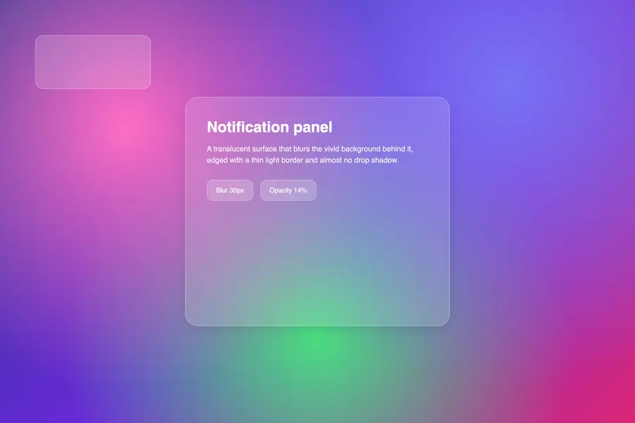
Glassmorphism renders interface panels as frosted glass: translucent surfaces that blur whatever sits behind them and let it show through as softened colour rather than hiding it behind a shadow.
Read it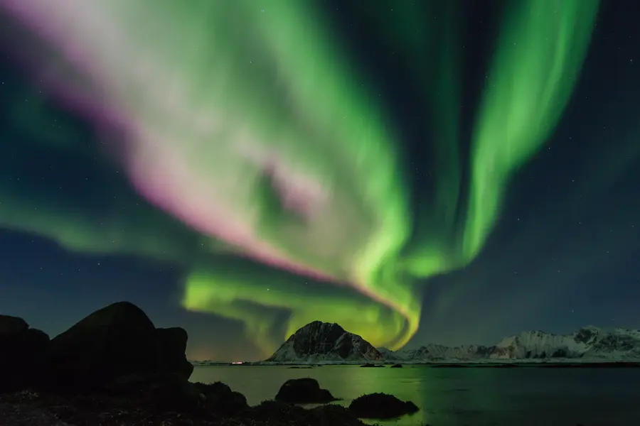
Aurora gradients are a colour technique: three or more hues blended along curving, non-linear paths rather than interpolated in a straight two-colour fade, built to evoke the shifting curtains of the aurora borealis, cosmic nebulae or bioluminescent water.
Read it
Surrealism is the practice of placing real, recognisable things where they do not belong: a locomotive in a fireplace, an eye in a cloudless sky, a wristwatch draped over a branch like wet cloth.
Read it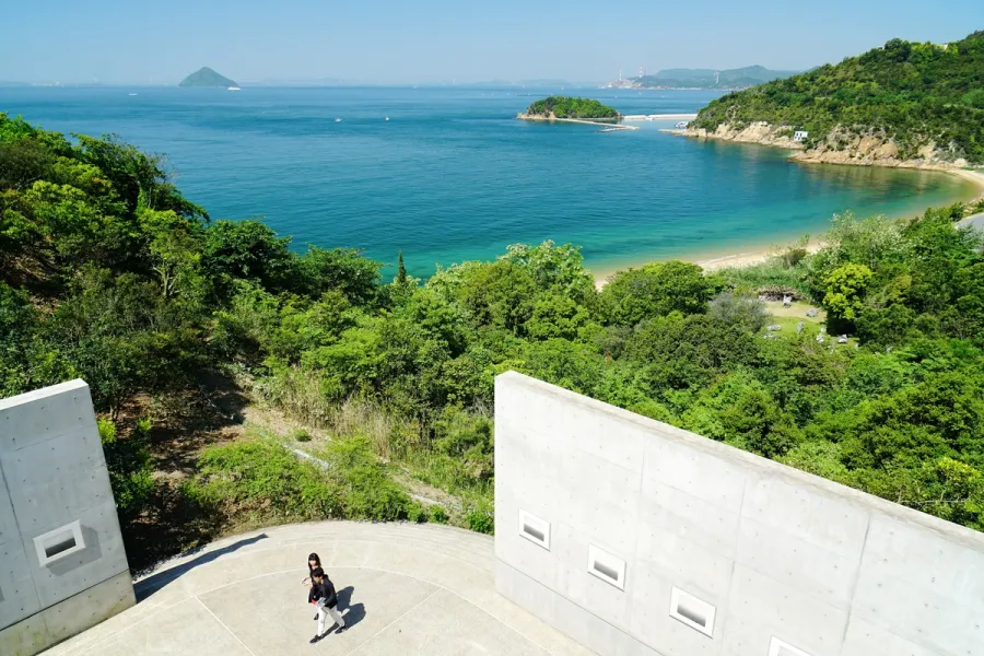
Japanese design philosophy names a group of aesthetic concepts, among them wabi-sabi, ma, kanso, shizen, and yugen, developed over centuries in Zen Buddhist and Shinto practice and applied to ceramics, gardens, architecture, and graphic design.
Read it
Colour theory is the study of how colours relate to each other on the wheel, across value, saturation, and temperature, and in combination so that you can reason through a decision rather than feel it.
Read it
Digital accessibility is the practice of building products people can use, whatever their permanent, temporary, or situational disability, measured against a published standard rather than opinion.
Read it