
2026-09-15
Nural Choudhury
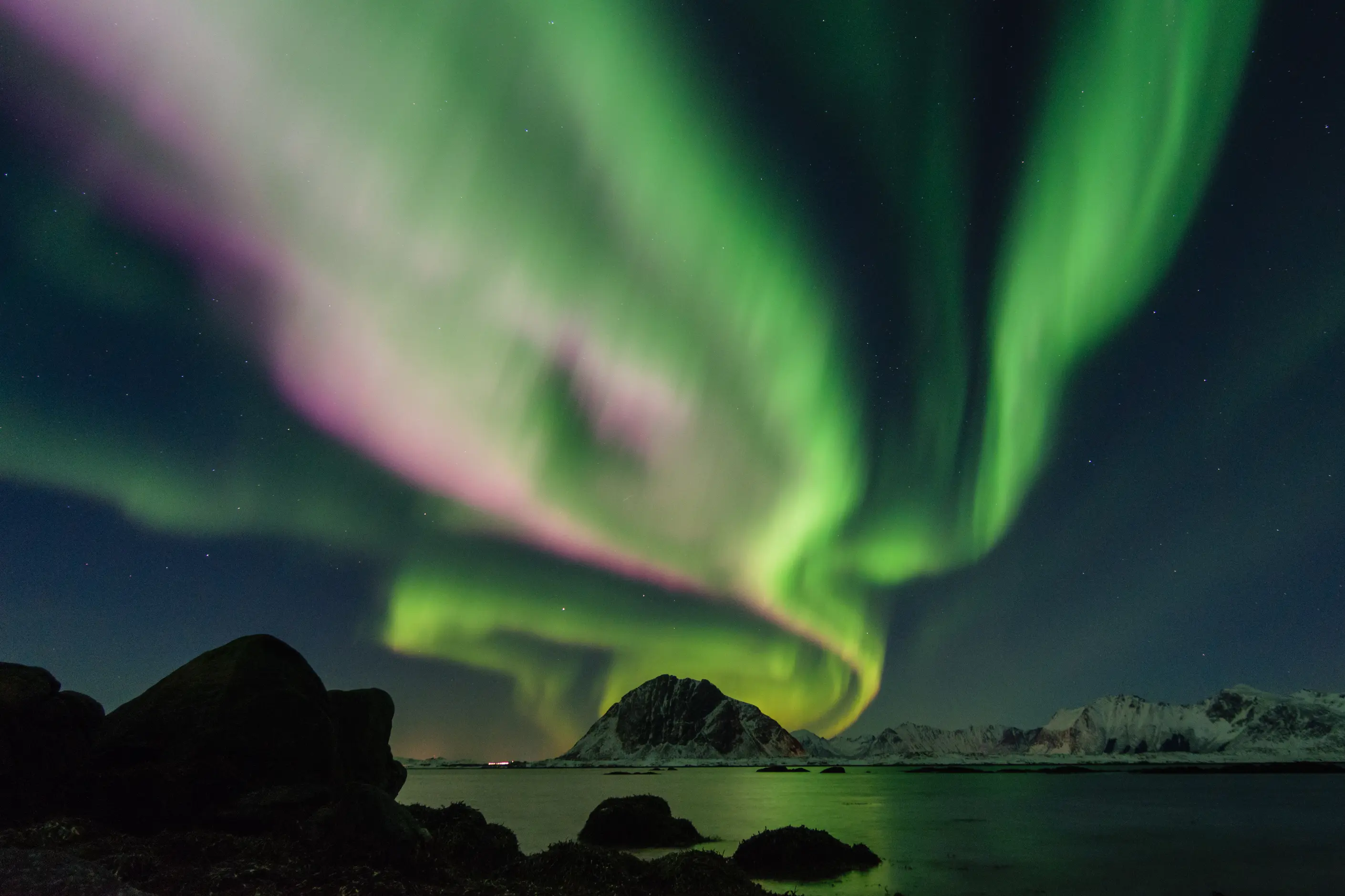
Aurora gradients are a colour technique: three or more hues blended along curving, non-linear paths rather than interpolated in a straight two-colour fade, built to evoke the shifting curtains of the aurora borealis, cosmic nebulae or bioluminescent water.
The style rose alongside a wave of technology branding around 2020, and its visibility peaked through 2021 and 2022 before settling into more selective, brand-specific use. Ethereal design names the wider dreamy, luminous mood a page can carry; aurora gradients name the specific multi-hue, non-linear colour technique that produces it.
three or more hues flowing in curved, asymmetric paths with no visible gradient stops, most often a cool palette of teals, blues, purples, and magentas carrying an occasional warm accent. Colour reads as luminous rather than flat: lighter, more saturated tone clusters where hues meet, as if lit from within, and soft edges rather than hard ones. The field frequently animates, drifting slowly in position, hue, or scale.
gradient-mesh tools and increasingly capable multi-stop CSS gradients made organic, multi-colour flows accessible to more designers from around 2020, and the technique spread quickly through technology branding and the generative and NFT-adjacent art of 2021 and 2022.
hero backgrounds, brand colour systems, motion loops, and generative digital art, applied with restraint in interfaces where legibility and performance matter more than atmosphere.
Gradient-mesh tools and increasingly capable CSS gradients made multi-colour, non-linear colour flows accessible to more designers from around 2020. The technique spread quickly through technology branding, and in design commentary of the period, Apple’s iOS interfaces and Stripe’s visual identity were widely cited examples of the aesthetic reaching mainstream commercial use.
The style also found currency in generative and NFT-adjacent digital art through 2021 and 2022, where procedural systems produced aurora-like colour flows at scale. That period established the look as a recognisable visual language for digital ownership and crypto-native culture, alongside its use in corporate branding. Visibility peaked in that window, and newer colour-flow approaches have since offered designers ways to keep the multi-hue complexity without repeating the same look.

| Element | What this style does | The tell |
|---|---|---|
| Colour | Three or more hues blend along curved, non-linear paths rather than a two-colour fade; a cool-dominant palette of teals, blues, purples, and magentas carries an occasional warm accent | No visible gradient stops; colour gathers in clouds rather than bands |
| Form and flow | The colour field undulates and changes direction at least once, rather than running along one line or radiating from a single fixed centre | A straight or single-centre gradient is not aurora; the path must bend |
| Light and depth | Colour reads as luminous: lighter, more saturated tone gathers where hues meet, as if lit from inside, and edges stay soft | Brightness sits at internal intersections, not at one edge of the frame |
| Motion | Many treatments animate, drifting colour position, hue, or scale slowly across the field | Even a still frame implies movement, through soft directional blur or a sense that the field continues past its edges |
| Typography and legibility | Text sits over a built contrast zone, a semi-transparent overlay, or a shadow or outline treatment, never directly on the raw gradient | The busiest part of the gradient never carries the primary heading |

| Neighbour | What it shares with aurora gradients | What separates them |
|---|---|---|
| Glassmorphism | Both read as current, premium technology aesthetics, and both belong to the same generation of interface design | Glassmorphism gets its depth from blur, transparency, and a light border over content beneath; aurora gradients get theirs purely from colour, with no blur or layering required |
| Synthwave design | Both use a saturated, glowing, multi-colour palette that reads as futuristic | Synthwave locks its palette and iconography, such as magenta, cyan, a grid horizon, and a setting sun, to a specific reference to the 1980s; aurora gradients draw an open, brand-adaptable palette from natural phenomena rather than one decade |
| Ethereal design | Both carry a dreamy, glowing, otherworldly mood | Ethereal design is a broad mood that spans soft photography, diffused light and pastel washes; aurora gradients are one specific colour technique, defined by multi-hue, non-linear flow, that can serve that mood |
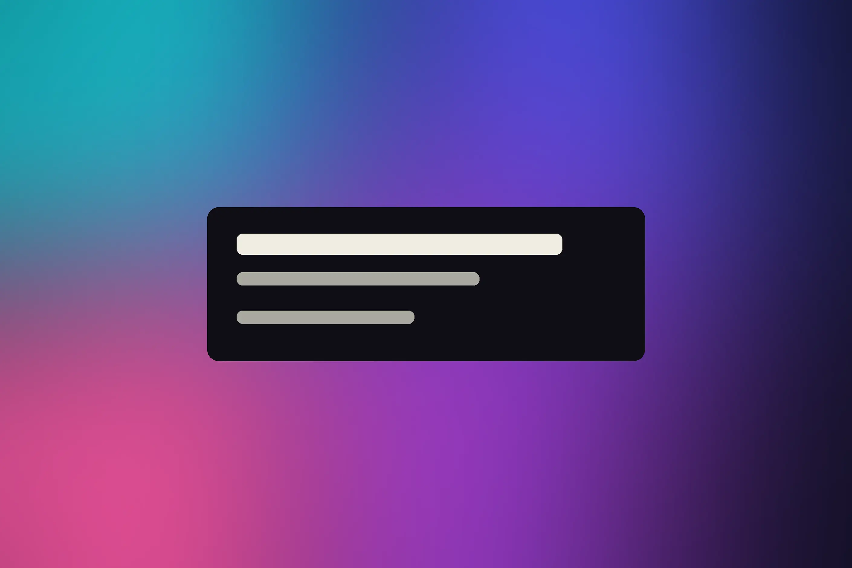
Plan the colour pathway before you build anything. Route transitions through colours that sit near each other on the wheel, and if you use complementary colours, keep them away from the point where they meet, since complementaries mixed at their midpoint turn grey or brown. See Colour Theory Basics for the colour-wheel relationships this style assumes rather than teaches.
Build the glow with value, not only hue. Treat the brightest, most saturated points as though they are lit from inside, and let the surrounding colour fade outward with a soft edge rather than a hard one.
Match your build method to your ambition. Gradient-mesh tools give full control over an irregular flow. At the same time, multi-stop CSS linear or radial gradients layered with blend modes approximate the effect well enough for most interface work without dedicated mesh software.
You must solve legibility before you ship it. Build a contrast zone into the gradient itself, or place text over a semi-transparent overlay, before you reach for a drop shadow or outline as a fallback, and check the result against Accessibility Standards for the contrast ratios text over a variable background must still meet.
Stay restrained in interface work. A large, moving gradient competes with content in a way a marketing hero background does not, so keep interface applications smaller, calmer and less animated than a brand backdrop.
Watch the pastiche risk directly. A generic aurora background pulled from a stock preset reads as a designer following a 2021 trend, not a considered decision. You must build the palette from the brand’s own colour system and use Colour Systems to keep it consistent across touchpoints, or leave the technique alone.
The clearest failure is dating. Visibility peaked through 2021 and 2022, so an unbranded, stock-preset aurora background now reads as a designer following a trend rather than making a decision. That recognition problem is the style’s most common criticism.
Muddy colour mixing is the most common technical failure. Complementary colours mixed at their meeting point turn grey or brown, and an unplanned colour pathway produces this by accident more often than by design.
Legibility failure follows close behind. A luminous, variable background can make text and interface elements unreadable, and the fix has to be built in rather than patched on afterwards: a contrast zone, an overlay, and a text treatment.
Complex, layered or animated gradients cost performance, particularly on mobile devices, so visual ambition has to be weighed against load and render cost rather than assumed to be free.
The deepest failure is reaching for the aesthetic because it is current rather than because its cosmic, premium, or wondrous associations serve the brief. A style chosen for what it signals about the designer, rather than for what it does for the work, rarely survives the trend that produced it.
Is an aurora gradient the same as a glassmorphism panel? No. Glassmorphism gets its effect from blur and transparency over content sitting beneath it; an aurora gradient is built from colour alone, with no blur or layered panel required, though the two techniques often appear together in the same interface.
What is the fastest way to start building one? Multi-stop CSS linear or radial gradients, layered with blend modes, approximate the effect without needing gradient-mesh software; they rarely reach the organic irregularity of a true mesh-built aurora.
Why do my colours turn muddy where they meet? Complementary colours mixed at their midpoint produce grey or brown. Route the palette through analogous colours on the wheel instead, and test the transition at several points, not only at the extremes.
Does the trend still read as current? It reads as dated when generic and unbranded, since visibility peaked through 2021 and 2022. A deliberate, brand-specific palette, built with the same rigour as any other colour system, still works.
How do I keep text readable over a moving background? Add a contrast zone, a semi-transparent overlay, or a text treatment such as a drop shadow, and position content over the calmer parts of the gradient rather than fighting the busiest area.
| Fact | Detail |
|---|---|
| Emerged | Around 2020, enabled by gradient-mesh tools and multi-stop CSS gradients |
| Peak visibility | 2021 to 2022, overlapping the generative and NFT-adjacent digital art period |
| Widely cited commercial examples | Apple’s iOS interfaces and Stripe’s visual identity, as cited in design commentary of the period |
| Typical palette | Cool-dominant: teals, blues, purples, and magentas, with an occasional warm accent |
| Build methods | Gradient-mesh tools for full organic control; multi-stop CSS linear or radial gradients with blend modes as a lighter alternative |
| Nearest neighbours | Glassmorphism, synthwave design, ethereal design |
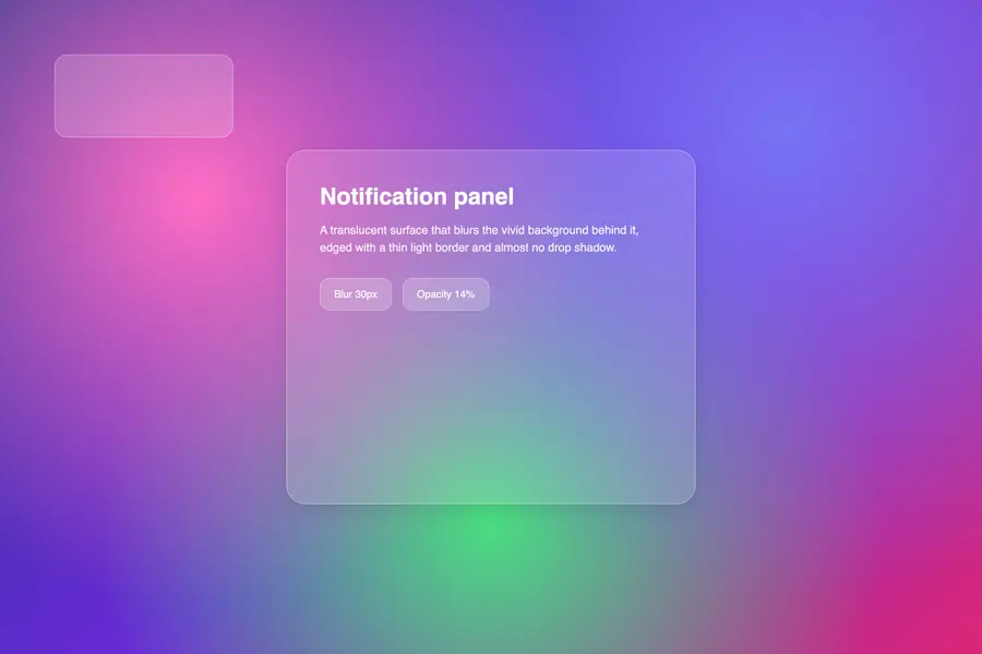
Glassmorphism renders interface panels as frosted glass: translucent surfaces that blur whatever sits behind them and let it show through as softened colour rather than hiding it behind a shadow.
Read it
Synthwave design is a retro-futurist visual style built decades after the decade it evokes: a neon, grid-lined, chrome-lettered vision of the 1980s assembled in the late 2000s from arcade games, science-fiction film and electronic music.
Read it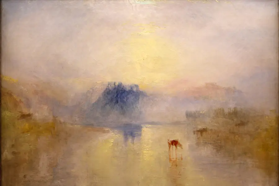
Ethereal design is a visual style built on pale, desaturated colour, translucent layered forms and diffused, blurred edges, so a composition reads as light rather than solid matter.
Read it
Colour theory is the study of how colours relate to each other on the wheel, across value, saturation, and temperature, and in combination so that you can reason through a decision rather than feel it.
Read it
Colour management is the discipline of specifying a colour precisely enough that a printer, a signage vendor and a web team can all reproduce it the same way, then documenting that specification.
Read it
Digital accessibility is the practice of building products people can use, whatever their permanent, temporary, or situational disability, measured against a published standard rather than opinion.
Read it