

2026-09-15
Nural Choudhury
Flat design is a digital interface style that replaces the shadows, gradients and simulated materials of earlier interface design with solid colour, geometric form and typographic hierarchy.
It set itself against skeuomorphism, the practice of making a screen imitate leather, paper, glass and other physical materials, and became the dominant interface language of the 2010s. It is most often mistaken for minimalism, but minimalism is a general philosophy of reduction that predates computing and applies to any medium, while flat design is a specific answer to one interface problem: a screen does not need to pretend to be a physical object, so nothing on it should look like one.
solid, saturated colour fills with no gradient or shading; icons reduced to uniform-weight geometric silhouettes; sans-serif type such as San Francisco, Roboto, or Segoe UI carrying the entire visual hierarchy; every element sitting on one flat plane with no drop shadow, bevel, or texture.
Microsoft’s Metro interface language from 2010, Apple’s iOS 7 in 2013 and Google’s Material Design in 2014, developed as mobile hardware and fragmenting screen sizes made detailed, textured interfaces impractical.
content-forward interfaces, dashboards and marketing pages that need to load quickly, scale across devices and let text and imagery lead rather than interface decoration.
Skeuomorphism dominated interface design through the 2000s. Note applications resembled yellow legal pads, calendars showed leather binding, and Apple’s own iOS became its most visible expression, with reflective icons, leather textures and torn-paper edges. The metaphors served a genuine purpose while computing was new to most users: a delete function drawn as a bin communicated its purpose through an existing physical association. By the early 2010s, the same textures created rendering overhead on mobile hardware and did not scale across a fast-growing range of screen resolutions.
Microsoft launched the flat interface language first, with Metro, later renamed Microsoft Design Language, from 2010 to 2012. Drawing on Swiss graphic design and transport signage, Metro used large typographic headers, bold untextured colour tiles and monochrome icons stripped to essential shapes. Windows Phone and Windows 8 carried it into consumer hardware.
Apple’s conversion in iOS 7, released in 2013 under Jony Ive, made flat design’s mainstream case. Realistic icons became geometric shapes, textures disappeared, and typography grew thinner and more prominent. The launch drew criticism for reduced legibility and unclear affordance, a criticism the style never fully answered. Google took a more gradual route: Google Now introduced card-based interfaces with solid backgrounds and minimal ornamentation before the company committed to a single design language. Google’s Material Design, introduced in 2014, then hybridised the two positions that had come before it, keeping flat design’s solid colour and geometric iconography but reintroducing shadow, tied to a defined elevation system, specifically to restore the affordance flat design had removed.

| Element | What flat design does | The tell |
|---|---|---|
| Colour | Applies bold, saturated fills with no gradient, tonal transition or simulated lighting | Colour and contrast, not shading, carry the hierarchy; palettes are often a single primary colour against neutral greys |
| Form and shape | Builds from basic geometric primitives: rectangles, circles, rounded rectangles at a consistent radius | Icons reduce to a recognisable silhouette at uniform stroke weight, with internal detail stripped away |
| Typography | Runs sans-serif system type at a strict grid, with size and weight doing the work decoration once did | Large, thin-weight headlines carry more visual authority than any other element on the screen |
| Layout and composition | Groups content into cards or tiles, often edge to edge, separated by colour and space rather than border | Elements touch the edge of their container or the screen; nothing floats inside a bevelled frame |
| Depth and texture | Removes drop shadow, bevel, gradient and material mimicry entirely | Every element sits on one visual plane; nothing appears to sit above or below anything else |
| Motion | Uses quick, linear transitions such as fades and slides | Animation never implies weight or elasticity; bounce and physics-based easing are absent because they imply a material property flat design rejects |

| Neighbour | What it shares | What separates them |
|---|---|---|
| Minimalism | Solid colour, geometric form, a suspicion of ornament | Minimalism is a general design philosophy of reduction that predates computing and applies to any medium; flat design is a specific answer to one interface problem, stripping every cue that a screen is anything other than pixels |
| Neumorphism and soft UI | Sans-serif type, a single-material, systematic feel | Neumorphism deliberately reintroduces shadow, extruding elements from a background of the same colour to restore the sense of touch flat design removed; flat design forbids shadow entirely |
| Glassmorphism | Descends from the same solid-colour, geometric lineage | Glassmorphism reintroduces translucency, background blur and a light border to build layered depth; flat design keeps every element opaque on a single plane |

Commit to the restraint completely. You must not mix shadow on some elements and none on others: pick full flat or a deliberate depth strategy, and hold it everywhere.
Build your colour, type and spacing system before you draw a single screen. Flat design’s clarity depends on a systematic foundation, not on decisions made screen by screen.
Audit what you already have before you commit. List every shadow, texture, gradient and realistic effect currently in the interface and judge each one for functional necessity rather than habit, so you remove decoration deliberately rather than by default.
Recover affordance without shadow. Use colour, weight, spacing, borders, or hover and press states to signal what is interactive, since none of the depth cues earlier interfaces relied on remains available to you.
Test with users who do not already understand your interface, and confirm they can tell an interactive element from a static one before you ship. Flat design’s history shows this failure recurs.
Watch the pastiche risk directly. Replacing every gradient with a flat fill and every icon with a silhouette does not make an interface current if the hierarchy and affordance underneath are unresolved. A flat coat of paint over an unresolved information structure repeats 2013’s mistake rather than learning from it.
Flat design’s defining absence, the removal of shadow, bevel and texture, took a functional signal away along with the decoration. A button that no longer looks raised reads as a label. A link that no longer looks inset reads as a heading. Interactive elements lost their most reliable visual cue.
Hierarchy suffered for the same reason. Depth had let one element sit visually above another; once every element occupies the same plane, colour, size, and spacing must do all that work, and many flat interfaces did not.
The learning cost fell hardest on users who had built their understanding of interfaces around the cues flat design removed, a raised button or an inset field. Accessibility suffered alongside affordance: low colour contrast is common in flat palettes, and users with visual impairments who relied on strong depth or border separation lost that cue too.
These are not incidental criticisms. That’s why neumorphism and glassmorphism exist. Both directly try to give an interface back some of the depth flat design removed, without returning to the realistic material simulation of skeuomorphism.
No. Minimalism is a general reduction philosophy that applies to any medium, from architecture to product design, and predates computing by decades. Flat design specifically rejects skeuomorphic depth cues in digital interfaces, and it belongs to a defined stretch of interface history rather than to design generally.
Why did flat design remove shadows in the first place? Rendering realistic textures and lighting effects strained mobile processors and did not scale cleanly across the fragmenting range of screen sizes and resolutions that arrived with smartphones. Removing them was a performance decision before it was an aesthetic one.
What replaced flat design? No single style did. Interfaces moved through a hybrid phase, sometimes called Flat 2.0, that reintroduced subtle shadows for functional layering, and Material Design formalised that with an elevation system. Neumorphism and glassmorphism later went further, each reintroducing depth differently as a direct answer to flat design’s affordance problem.
Is flat design still in use today? Its principles persist in a modified form. Contemporary interfaces treat depth as a tool applied where it serves a function: a modal, a dropdown, a floating button, rather than a philosophy applied everywhere or nowhere, which is the position flat design itself never reached.
| Fact | Detail |
|---|---|
| Reaction against | Skeuomorphism, the dominant interface style of the 2000s |
| Metro, later Microsoft Design Language | Microsoft, 2010 to 2012, Windows Phone and Windows 8 |
| iOS 7 | Apple, 2013, design led by Jony Ive |
| Material Design | Google, 2014, reintroduced shadow tied to an elevation system |
| System typefaces | San Francisco (Apple), Roboto (Google), Segoe UI (Microsoft) |
| WCAG contrast baseline | 4.5:1 for normal text, 3:1 for large text and UI components |
| Direct successors | Neumorphism and soft UI, and glassmorphism, both reintroducing depth flat design removed |

Minimalism in design reduces a composition to the elements it cannot function without, so colour, form, type, and space each carry more weight because there is less to look at.
Read it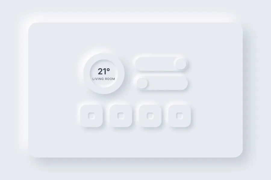
Neumorphism, or Soft UI, is a digital interface style that shapes buttons and panels as if they were moulded from the same continuous surface as their background, using two opposing soft shadows rather than colour or elevation to show whether an element rises or sinks.
Read it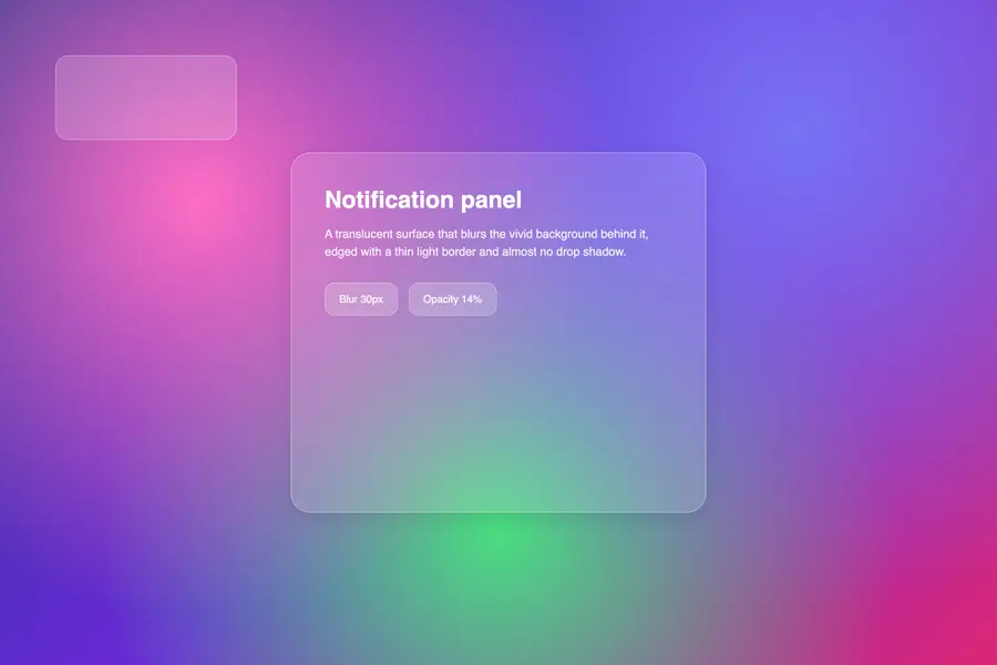
Glassmorphism renders interface panels as frosted glass: translucent surfaces that blur whatever sits behind them and let it show through as softened colour rather than hiding it behind a shadow.
Read it
Digital accessibility is the practice of building products people can use, whatever their permanent, temporary, or situational disability, measured against a published standard rather than opinion.
Read it
A design system is a governed set of reusable components, patterns and rules that a team uses to build consistent digital products at scale, and it is neither a static style guide nor a component library on its own.
Read it
Colour theory is the study of how colours relate to each other on the wheel, across value, saturation, and temperature, and in combination so that you can reason through a decision rather than feel it.
Read it
Layout is the arrangement of elements inside a frame: what a viewer sees first, second, and third, and what the space between things does as they look.
Read it
Typography is the craft of shaping and spacing type so readers can recognise its letters and follow its meaning without friction.
Read it