
2026-09-15
Nural Choudhury
Mixed media design combines two or more materials or techniques, such as photography, illustration, hand-drawn mark-making, and digital compositing, inside one composition, so the contrast between media carries meaning no single medium could carry alone.
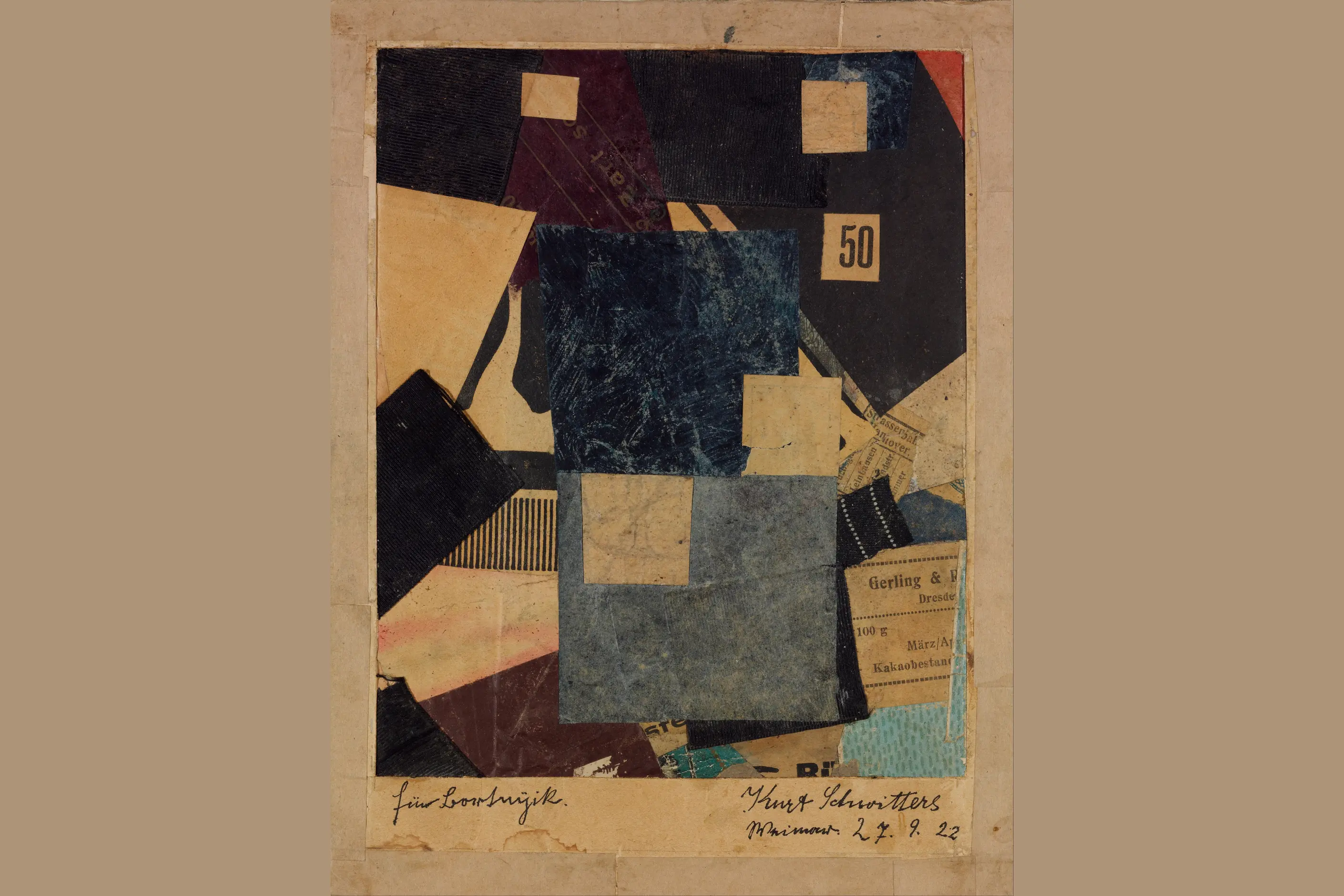
Cubist collage and Dada photomontage introduced the technique of joining found and made material on one surface. Still, Dada aimed that technique at a specific target: a wartime culture it judged bankrupt. Mixed media design keeps the combinatorial method without that inherited target, and is now an ordinary compositional approach used across editorial, brand and packaging design.
one frame holding at least two visibly different media, a photographic fragment keeping its own grain beside a hand-drawn or painted mark, or a scanned physical element finished with digital colour correction. Type, where it appears, behaves as another material to be layered, cropped or overprinted rather than sitting in a clean text block. Layers create a depth no single medium produces alone, elements reading at different apparent distances within the same picture.
Cubist papiers collés, then Dada photomontage, extended through Surrealist assemblage, Pop Art’s use of mass-culture imagery, and postmodern design’s combination without hierarchy, now supported by layer-based digital compositing in tools such as Photoshop.
editorial illustration and brand imagery that must hold documentary fact and invented interpretation in the same frame, and packaging or covers that want a handmade signal inside a category dominated by pure photography or pure illustration.
Pablo Picasso and Georges Braque’s papiers collés, from 1912, introduced found materials- newspaper, wallpaper and musical scores- into painting, breaking with the idea that a picture had to be made from paint alone. The move permitted later artists to build an image from more than one kind of material.
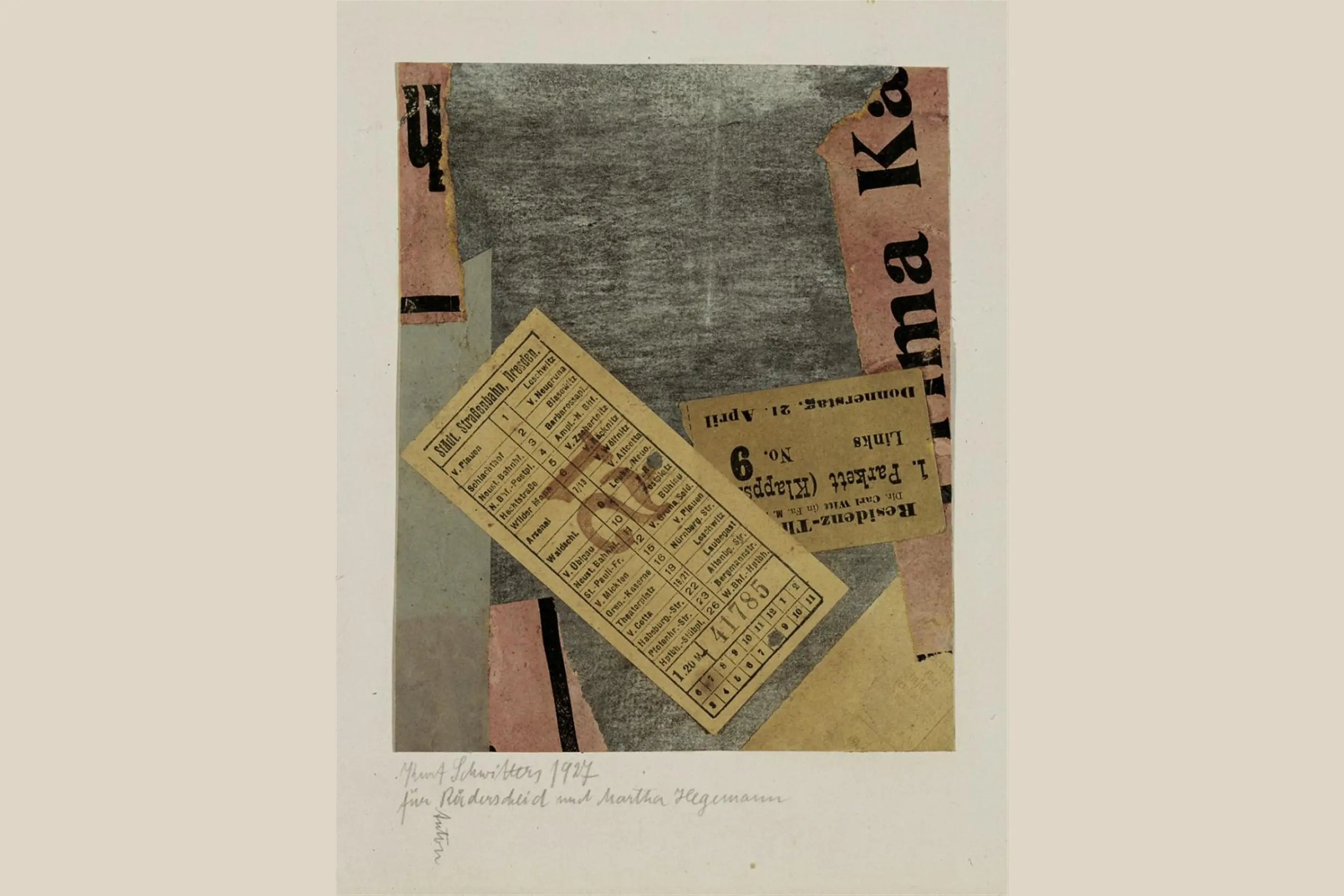
Dada artists, including Hannah Höch, Raoul Hausmann and Kurt Schwitters, took that permission further through photomontage, combining found imagery, typography and materials into compositions that were political and absurdist by design. Their target was specific: a European culture that had produced the First World War and, in their view, forfeited its claim to rational authority.
Surrealists then used collage and assemblage to reach unconscious imagery, building dreamlike, psychologically charged compositions from unexpected combinations. Pop artists combined fine art with mass-culture imagery, working through collage, screen printing and mechanical reproduction to collapse the distinction between high and low culture.
Postmodern design absorbed the combinatorial habit without the politics that had driven it. Designers including David Carson and Stefan Sagmeister mixed whatever material a project needed, and the mixing itself, rather than any shock or dream logic, became the point. Digital tools then made scanning, compositing and layer-based editing routine, turning what had been a deliberate art-historical strategy into a standard method available to anyone with image-editing software.

| Element | What this style does | The tell |
|---|---|---|
| Colour | Imposes one corrected palette across elements that began in different colour worlds | Consistent temperature and saturation bridging a photograph and a hand-made mark |
| Form and shape | Sets hard, camera-defined edges against loose hand-drawn or painted marks in one frame | A fragment breaking its own rectangular photographic frame, or a drawn line crossing a photographic edge |
| Typography | Treats letterforms as another material to layer, crop or overprint rather than a clean text block | Type interrupted by or bleeding into imagery instead of sitting cleanly above it |
| Layout and composition | Builds depth from stacked, overlapping layers rather than one flat plane | Elements reading at different apparent distances inside a single still frame |
| Materials and texture | Sets contrasting surface qualities against each other on purpose, paper grain against vector smoothness, halftone dot against soft brushwork | Two or more distinct surface textures visible in the same image, neither disguised as the other |
| Imagery and ornament | Places found photographs, family, stock or historical, next to invented or hand-rendered imagery | One element the viewer reads as documentary fact sitting beside one they read as invention |
| Neighbour | What it shares | What separates them |
|---|---|---|
| Doodle art | Visible hand-made marks and a preference for process over polish | Doodle art stays inside one consistent mark-making style, usually pen or line-based, without combining sources. Mixed media design’s whole method is combining two or more distinct materials or techniques inside one piece |
| Dadaism | The photomontage and collage technique, and the same instinct to join found and made material on one surface | Dada aimed its combinations at a specific historical target, a wartime culture it judged as bankrupt, and lasted roughly eight years before dissolving into Surrealism. Mixed media design carries no inherited target: it is a durable, general-purpose method used in ongoing editorial and commercial work |
| Graffiti design | An interest in found surfaces and layered material, and a rejection of one single, clean production process | Graffiti is a lettering-based subculture built around a writer’s name, produced in public space under its own rules for credit and site. Mixed media design is a studio-based method with no site, no subculture and no name-based writing system attached to it |

Decide what each medium must contribute before you combine it. Photography carries documentary weight, illustration carries interpretation, hand-drawn marks carry human presence, and digital precision carries control. Combine only the media whose job you can name.
You must establish a unifying device, a colour palette, a tonal range or a consistent edge treatment, before you add variety. Without it, the composition reads as assembled rather than designed.
Test contrast for coherence before you commit. Check whether elements enhance or fight each other, and adjust colour, scale or placement until the differences generate energy rather than confusion.
Match technical quality across elements, or make the mismatch clearly intentional. A high-resolution photograph beside a pixelated scan reads as an error unless the disparity is doing a job.
Cut before you add further. Remove any element that isn’t earning its place, since a combination’s quality comes from what you leave out rather than how much you layer in.
The pastiche risk sits in the lineage. Reaching for Dada’s or Surrealism’s visual shock, torn edges, war-era grain, dream-logic scale, as a decorative mood costs nothing and proves nothing. Borrow the combinatorial method, not the politics dressed up as decoration.
Incoherent assembly is the most common failure: elements combined without visual logic, so the work looks assembled rather than designed. It happens when excitement about a combination overtakes compositional discipline.
Fighting elements are a related failure. Media working against each other, contrasts producing confusion instead of interest, catches designers who assume combination automatically produces harmony and skip testing it before committing.
Mixing for its own sake adds complexity because it is possible, not because it serves communication. A single medium would often do the job better, and the honest question- would this work if I removed one element?- exposes the ones that do not earn their place.
Technical mismatch reads as a mistake rather than a choice: unequal resolution or finish between elements, unless the difference is clearly deliberate, looks like an oversight. Over-complexity follows the same pattern at scale, too many elements accumulating until variety becomes chaos rather than richness.
This lineage has a further failure. Dada’s photomontage was a political weapon aimed at a named target, not a mood board. Work that reaches for photomontage’s torn edges or war-era grain purely for edge, with no argument behind it, borrows the movement’s shock and discards the reason it existed, a real cost worth naming rather than skating past.
What is the real difference between mixed media design and Dada photomontage? Both combine found and made material on one surface, but Dada pointed that combination at a specific historical target, a wartime culture it judged as bankrupt. Mixed media design carries no inherited target and works as an ordinary compositional method in editorial, brand and packaging work today.
Does a mixed media piece need a physical component? No. Photography combined with digital illustration in one composited file counts, provided the media are genuinely distinct, and the combination does the work. Physical materials, paper, paint, found objects, add tactile qualities digital alone cannot, but they are not a requirement.
How many media are too many to combine in one piece? There is no fixed number. The test is whether each element earns its place: cut anything that doesn’t change what the piece communicates, since the quality of a combination depends on what is left rather than how many layers went in.
When should I reach for a single medium instead? When the content doesn’t need internal contrast to make its point, or when quality and budget cannot stretch to unify several sources convincingly. A single well-made medium beats a combination that fights itself.
Is Photoshop or Procreate enough to make something mixed media? Software supplies the compositing, layering and blending that combination needs. Still, the medium only qualifies once at least two genuinely different sources, a photograph and a hand-drawn mark, for example, sit inside the same frame in dialogue with each other.
| Fact | Detail |
|---|---|
| Originating technique | Papiers collés, Pablo Picasso and Georges Braque, from 1912 |
| Photomontage ancestor | Dada, Hannah Höch, Raoul Hausmann and Kurt Schwitters |
| Later lineage | Surrealist assemblage, Pop Art collage and screen printing, postmodern design |
| Named postmodern practitioners | David Carson, Stefan Sagmeister |
| Enabling technology | Layer-based digital compositing, scanning, masking and blend modes, in tools such as Photoshop and Procreate |
| Typical applications | Editorial illustration, brand imagery, packaging design, motion and interactive work |

Doodle art is the deliberate use of casual, unplanned mark-making- the loops, faces and repetitive patterns people draw while on the phone or half-listening in a meeting- as a professional visual style.
Read it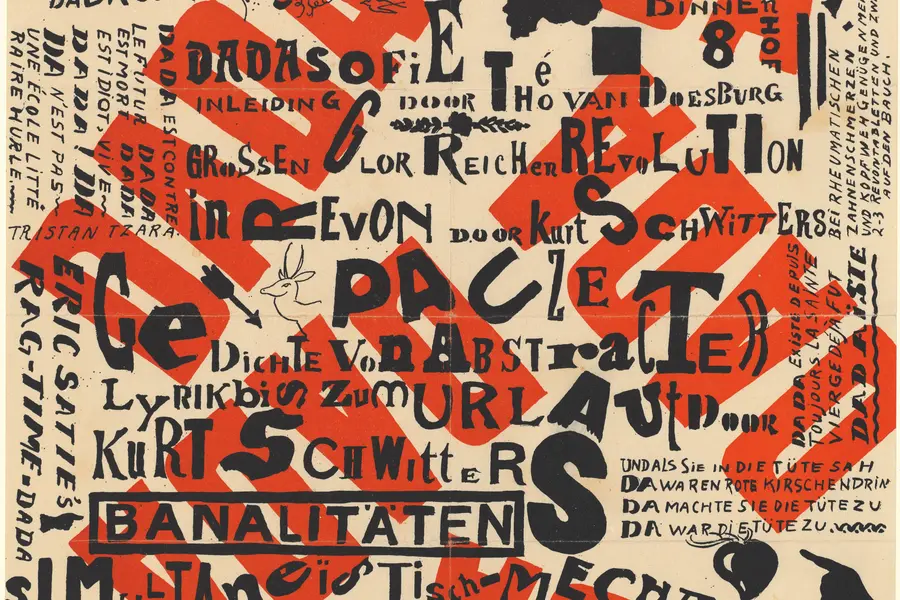
Dadaism is an anti-art movement that began in Zurich in 1916, using deliberate absurdity, chance operations and appropriated imagery to reject beauty, meaning and rationality after the First World War exposed their bankruptcy.
Read it
Graffiti design is the lettering-based visual culture that began with tags on Philadelphia and New York streets and subway cars in the late 1960s and early 1970s, then developed into throw-ups, pieces and wildstyle through decades of practice rather than formal schooling.
Read it
Surrealism is the practice of placing real, recognisable things where they do not belong: a locomotive in a fireplace, an eye in a cloudless sky, a wristwatch draped over a branch like wet cloth.
Read it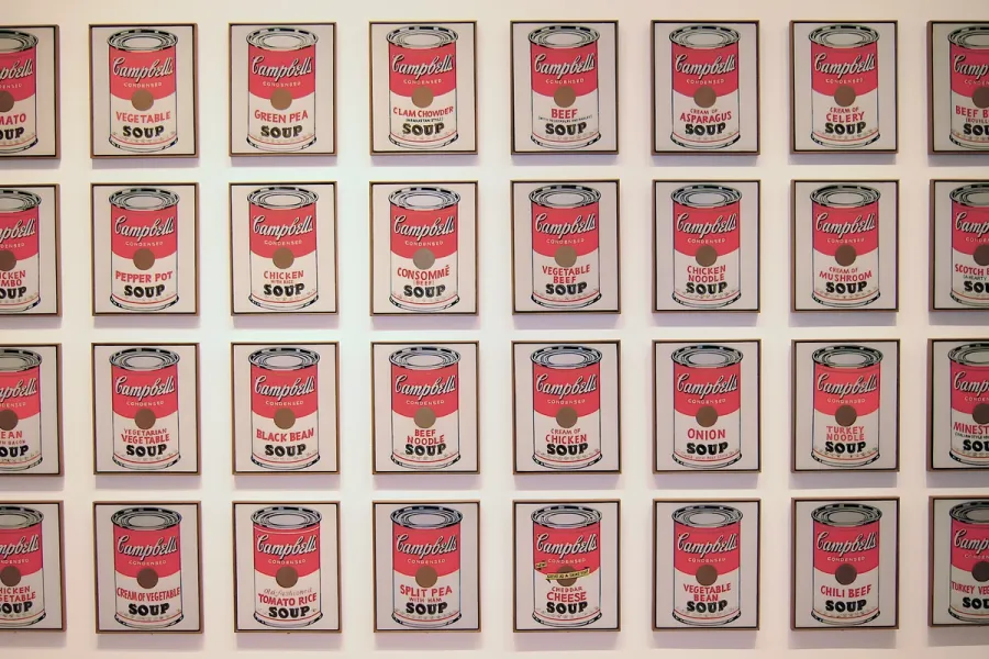
Pop Art is the movement that took commercial imagery- the soup can, the comic panel, the celebrity photograph- and treated it as fit subject matter for fine art, rendered flat, bright and mechanically precise.
Read it
Postmodernism in design is a movement that began in the late 1960s and crystallised through the 1970s and 1980s, rejecting modernism’s claim to universal rules: the grid, the neutral sans, the belief that “less is more.” Where the International Typographic Style and Bauhaus functionalism treated a small set of principles as correct for any brief, postmodernism treated those principles as one convention among many, worth quoting, distorting or discarding as the project demanded.
Read it