

2026-09-15
Nural Choudhury
An optical illusion is a visual pattern that reliably makes the brain construct a percept that contradicts the physical stimulus: a line that is not really longer, a surface that does not really move, a figure that is not really three-dimensional.
Op art is the mid-century movement that made this contradiction the subject of the work itself; design borrows the same mechanisms for narrower, purposeful ends, attention, depth, or a hidden second reading, rather than putting the perceptual effect on display for its own sake. The distinction matters because a well-used illusion disappears into the job it does, while Op art wants you to notice that your eyes are being worked.
a designed use of a known perceptual mechanism, converging lines that inflate apparent size, arrowheads that stretch or shrink a line, patterns that appear to shimmer or drift, a figure that flips between two readings. The tell is that the effect is deliberate and named, not incidental.
the study of these mechanisms sits in Gestalt psychology and vision science from the early twentieth century onward; specific illusions carry their own dates and names: the Müller-Lyer arrows, the Ponzo lines, Rubin’s vase. Op art turned the same science into a fine-art movement through the 1960s, led by Victor Vasarely and Bridget Riley.
attention-getting marks, logos with a discoverable second reading, depth cues on a flat screen, and diagnosing why a design looks subtly wrong when nothing measurable is out of place.
The illusions themselves are older than any design movement: Roman wall painters were using trompe l’oeil to fool the eye about depth, and the geometric illusions covered here, Müller-Lyer, Ponzo, Zöllner, were named and studied by nineteenth- and early twentieth-century psychologists working out how vision organises raw sensation into a coherent scene. Gestalt psychology, developed in Germany from the 1910s, gave design its working vocabulary for that organisation: proximity, similarity, continuity, closure, figure-ground, common fate. These are not illusions themselves; they are the rules perception follows, and illusions work by putting those rules under contradictory pressure.
Op art turned the science into an art movement, and Victor Vasarely and Bridget Riley, working through the 1960s, made paintings whose entire subject was the instability of perception itself: grids that seem to bulge, stripes that seem to vibrate, moiré patterns that will not sit still on the canvas. M. C. Escher’s lithographs pursued a related but distinct project, drawing impossible architecture, stairs that climb and return, water that flows uphill, where each local joint reads correctly, and the whole cannot exist. The 2015 dress photograph, where viewers disagreed in large numbers about whether a garment was blue and black or white and gold, is a recent, widely documented demonstration that colour perception depends on assumptions about the light source rather than reading raw pixel values.

| Element | What this style does | The tell |
|---|---|---|
| Geometric distortion | Converging lines, arrowheads, or a surrounding frame change how a size, length, or angle is read, as in the Ponzo and Müller-Lyer illusions | The distorted element is objectively unchanged; only its context has moved |
| Impossible and ambiguous form | A figure supplies contradictory depth cues, as in the Penrose triangle, or supports two readings that cannot be held at once, as in Rubin’s vase or the duck-rabbit | Each local part reads correctly; the contradiction only appears once the whole is assembled |
| Motion from stillness | Repeating high-contrast patterns, as in Akiyoshi Kitaoka’s rotating-snakes pattern, trigger apparent movement in a static image | Nothing on the page is animating; the movement is generated by the peripheral vision system, not by pixels changing |
| Colour and context | Identical colours read as different, or different colours read as the same, depending on what surrounds them, as in simultaneous contrast | The colour value in the file is constant; only the perceived colour changes |
| Figure-ground and hidden form | A second shape is built from the negative space around a primary form, most famously the arrow inside FedEx’s wordmark | The hidden form only appears once noticed, and cannot then be unseen |

| Neighbour | What it shares | What separates them |
|---|---|---|
| Pointillism | Both rely on the eye doing work the image does not do for it: Pointillism blends discrete dots into continuous colour at a distance, exactly the kind of perceptual construction illusions exploit | Pointillism uses one specific mechanism, optical colour mixing, as a consistent painting technique across a whole canvas; optical illusion design draws on dozens of distinct mechanisms and applies them selectively, one effect to one problem |
| Sacred geometry | Both can use precise, repeating geometric structure, and a mandala or a tessellated illusion can look superficially similar | Sacred geometry’s structures carry symbolic or spiritual meaning tied to a tradition; an optical illusion’s geometry has no meaning beyond the perceptual effect it produces |
| Tessellation and pattern systems | Both can use interlocking, mathematically precise tiling, and some illusions, the café wall effect among them, are built from a tessellated grid | Tessellation is about how shapes tile a plane without gaps or overlaps; an illusion is about what that tiling makes the eye misread. A tessellation can exist with no illusory effect at all |
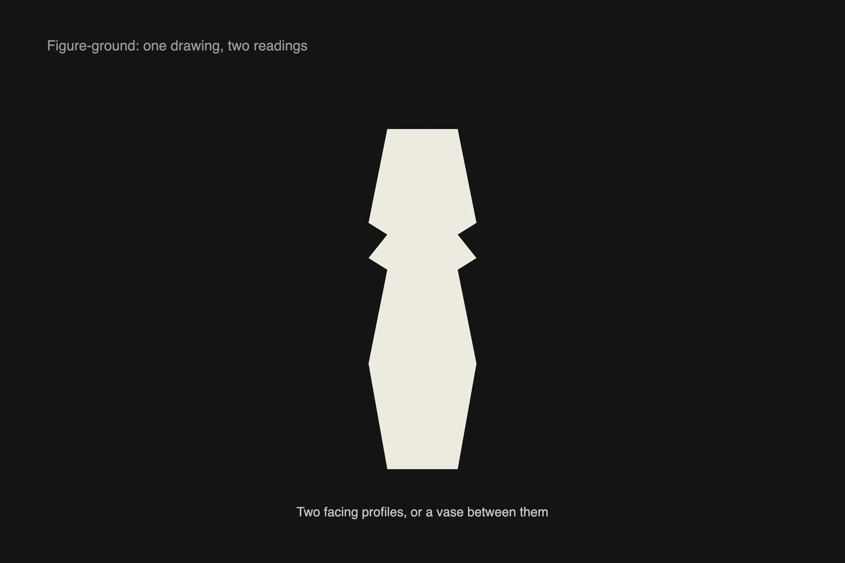
Decide what the illusion is for before choosing one. Attention, a sense of depth on a flat surface, a hidden second message, or a diagnostic check on why something looks wrong are different jobs, and each points to a different mechanism from the vocabulary table.
Match the effect to how long the viewer will look. A figure-ground illusion like a hidden arrow rewards a second glance and works well in a logo seen repeatedly over time. A motion illusion demands instant, involuntary attention and suits a single high-impact moment, not a persistent interface element.
Get the proportions exact. Geometric illusions such as Müller-Lyer depend on specific angle relationships, and colour illusions depend on specific hue and value relationships; a rough approximation of the mechanism often produces no effect at all rather than a weaker one.
Test the effect at production scale, in the actual viewing conditions, on the actual hardware. An illusion tuned on a large monitor can vanish at business-card size, and a peripheral-drift pattern that shimmers in a static image can look merely busy once it is scrolling past on a phone.
Subordinate the trick to the message. An illusion strong enough to dominate the eye leaves the viewer looking at the mechanism instead of the communication, which is the difference between a design decision and a party trick.
Watch for pastiche. Reaching for an illusion because it demonstrates cleverness, rather than because it solves an attention, depth, or hierarchy problem, is the most common failure in this vocabulary and the one worth checking for before shipping.
The most common failure is an illusion with no purpose: an effect included to show it can be done, not because it serves the brand, the message, or the hierarchy. A viewer who notices only the trick, not what it was for, has been shown a gimmick.
The second is accidental illusion. Perceptual effects operate whether or not a designer intends them, and a layout can read as misaligned, unevenly weighted, or oddly coloured because it collides with one of these mechanisms by accident rather than by design. Type designers correct for this deliberately, adjusting round letterforms to sit slightly larger than square ones. Hence, the two read as equal size, because the raw geometry does not match the perceived result.
The third is accessibility. Motion illusions can trigger vestibular discomfort, and high-contrast repeating patterns of the kind that make rotating-snakes work can cause visual discomfort or, in some viewers, photosensitive reactions. An illusion strong enough to work is often strong enough to cause a genuine physical response in part of the audience, and you must test this with real viewers rather than assume it away.
Is Op art the same as an optical illusion? No. Op art is a named mid-century movement, led by Victor Vasarely and Bridget Riley, that made perceptual instability its subject matter. An optical illusion is the underlying mechanism, and it existed long before the movement and gets used for narrower design purposes that have nothing to do with fine art.
Why does the FedEx arrow count as an optical illusion? It uses figure-ground perception, the same mechanism behind Rubin’s vase: the arrow isn’t drawn; it is built from the negative space between the E and the x, and the brain assembles it once it starts looking for a shape rather than reading letters.
Do illusions work the same for everyone? No. Some ambiguous figures, such as the duck-rabbit or Rubin’s vase, flip between readings differently depending on what a viewer is primed to expect, and colour illusions depend on assumptions about the light source that can genuinely differ between viewers, as the 2015 viral dress photograph demonstrated at scale.
Can an illusion be accessible? Static geometric and figure-ground illusions carry little risk. Motion illusions and high-contrast repeating patterns carry real risk for vestibular and photosensitive viewers, so the intensity of the effect, not just its presence, is what needs testing.
Where do these mechanisms come from? Vision science and Gestalt psychology, developed from the early twentieth century onward, established the perceptual rules (proximity, similarity, continuity, closure) that illusions deliberately contradict. Individual illusions, Müller-Lyer, Ponzo, Zöllner, among them, carry their own separate histories within that research.
| Fact | Detail |
|---|---|
| Op art movement | Through the 1960s, led by Victor Vasarely and Bridget Riley |
| Related lithographic tradition | M. C. Escher’s impossible architecture, developed across the same period |
| Gestalt psychology | Developed in Germany from the 1910s onward, supplying the perceptual vocabulary illusions exploit |
| Trompe l’oeil precedent | Roman wall painting, the earliest documented use of illusory depth on a flat surface |
| Peripheral drift example | Akiyoshi Kitaoka’s rotating-snakes pattern |
| Widely documented colour-context case | The 2015 viral photograph of a dress, disputed as blue and black or white and gold |
| Hidden figure-ground logo example | FedEx’s wordmark, the arrow built from the space between E and x |
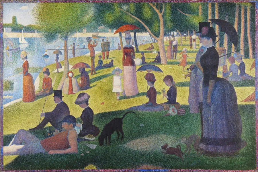
Pointillism is a painting technique developed in France in the mid-1880s that builds an image from small, separate dots of pure colour rather than colours mixed on a palette.
Read it
Sacred geometry treats certain geometric forms and proportions, among them the golden ratio, the Platonic solids, and the Flower of Life, as evidence of a divine or cosmic order laid over mathematics that is otherwise plain and checkable.
Read it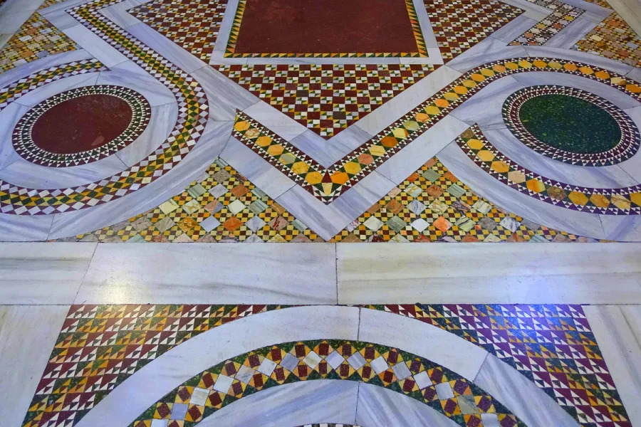
Tessellation is the covering of a plane with shapes that meet edge to edge, with no gaps and no overlaps, and it follows a small, provable set of mathematical rules rather than taste.
Read it
Colour theory is the study of how colours relate to each other on the wheel, across value, saturation, and temperature, and in combination so that you can reason through a decision rather than feel it.
Read it
Typography is the craft of shaping and spacing type so readers can recognise its letters and follow its meaning without friction.
Read it
Digital accessibility is the practice of building products people can use, whatever their permanent, temporary, or situational disability, measured against a published standard rather than opinion.
Read it