
2026-09-15
Nural Choudhury
Environmental design is the practice of shaping visual communication within physical space: the signage, wayfinding systems, and graphics that guide people through buildings, campuses, and cities.
It is design for the built environment, not for ecological sustainability; that second reading of “environmental design” belongs to sustainable design and climate-conscious design.
This page covers wayfinding and signage, the relationship between graphics and architecture, and material and legibility at architectural scale. Biophilic design supports wellbeing through nature connection in space, and information architecture structures content rather than physical space.
A wayfinding and signage system that people trust: it orients them on arrival, guides them at each decision point, and confirms they remain on the right path. Graphics that read as part of the building rather than applied on top of it.
Any physical space where people who do not already know their way around need to find something: hospitals, campuses, transit hubs, mixed-use buildings, and any project where signage meets architecture.
Walk the route before you design a single sign. A floor plan shows you where rooms are. It doesn’t show what a person sees, in what order, as they move through the building.
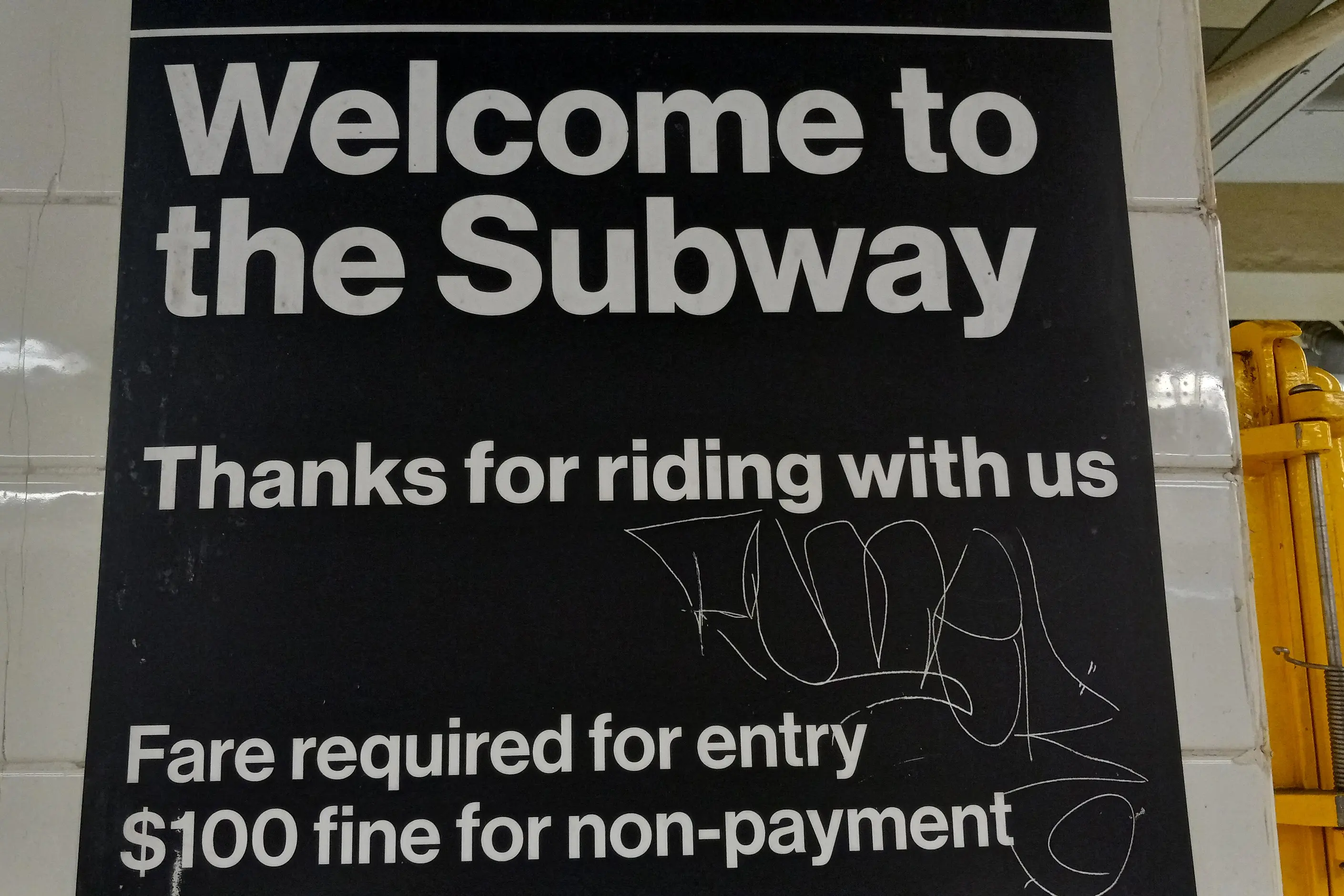
Environmental design draws on two lineages. One is graphic design applied to architecture and identity: Lance Wyman’s identity and wayfinding system for the Mexico City 1968 Olympics, and Massimo Vignelli’s signage system for the New York City subway, both showed that a consistent graphic language could organise a complex physical environment.

The other lineage is urban planning and cognitive psychology. Kevin Lynch’s 1960 book “The Image of the City” described how people build mental maps from five elements: landmarks, paths, districts, edges, and nodes. Wayfinding design still uses this vocabulary to describe how people orient themselves in space.

Wayfinding is a system, not a set of signs. It does four jobs, and missing any one breaks the system even when every individual sign is well designed.
| Job | What it does |
|---|---|
| Orientation | Tells someone where they are |
| Identification | Confirms they have arrived |
| Direction | Shows which way to go |
| Confirmation | Reassures them they remain on the right path |
People do not need all of this information at once. A good system discloses it progressively, at the point where a decision has to be made, rather than loading a single sign with everything a visitor might ever need.
| Viewing distance | Information layer | Typical content |
|---|---|---|
| 50 metres and beyond | Identification and orientation | Building identification, district markers |
| 5 to 50 metres | Directional guidance | Room numbers, directional arrows, named destinations |
| Under 5 metres | Detailed reference | Maps, directories, regulatory information |
Signage and graphics sit inside a building, and the two either work together or visibly fight. Before I design anything, I read the architecture: its style, material palette, sightlines, and lighting. Integration means matching material, scale, alignment, and colour to what is already there.
Contrast is a legitimate alternative to integration. A bold, contemporary sign in a classical building can add vitality; a colourful wayfinding system can be made to stand out from neutral architecture on purpose, for legibility. The difference is that the choice is deliberate, not left to chance.
Material choice sits underneath all of this, because environmental graphics have to be fabricated and then maintained, not only rendered.
| Material | Character | Maintenance consideration |
|---|---|---|
| Metal | Durable, precise finishes | Resists weather; polished finishes show scratches |
| Acrylic and plastics | Lightweight, can be transparent | Surfaces and edges show wear faster than metal |
| Wood | Warm, can be sustainably sourced | Needs finishing and re-finishing against exposure |
| Stone | Permanent, prestigious | Heavy and expensive to install or change later |
| Glass | Transparent, reflective | Needs cleaning access; safety limits on structural use |
| Digital display | Dynamic, programmable | Shortest lifespan; needs a refresh plan from day one |

You must walk the route before you open a floor plan. A plan tells you where rooms sit. It does not tell you what a person sees, at what distance, from what angle, at each point on their journey.
Map the decision points first. Mark every corridor fork, every escalator arrival, and every lobby with more than one exit: these are the only places a sign has to do real work. Everywhere else, confirmation is enough.
Name places the way a visitor would ask for them, not the way the organisation files them internally. A visitor looking for “radiology” should never have to translate that into an internal department code first.
Size type to the furthest distance it has to be read from, and test it at that distance before you commit to fabrication. A typeface that reads clearly on a screen at arm’s length does not automatically read across a lobby.
Choose materials for how they age and how they get cleaned, not only for how they photograph. Ask whoever maintains the building how they clean the existing signage before you specify a new finish.
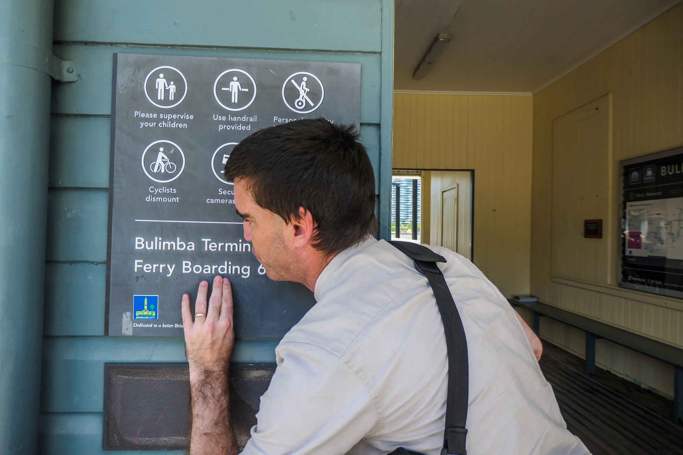
Take a hospital extension that connects to an older building through a shared lobby. On arrival, a visitor needs one overview sign: a department directory and a you-are-here indicator, not a list of every room in the building.
Where the new and old buildings meet, a decision point needs clear direction. It needs directional signage naming the destination the way a patient would ask for it: “imaging”, not an internal department code.
Along the corridor to imaging, confirmation signage repeats the destination name at intervals, so a person two minutes into a walk without a junction still knows they are on the right route.
Type on that corridor is sized for the furthest point someone will read it from, checked by standing at that distance rather than estimated at a desk. The material is chosen for a corridor that gets mopped daily and knocked by trolleys, not for how it looks in a rendering.

I have watched a wayfinding system get designed entirely from a floor plan, with no one walking the route itself. It looked coherent on paper. On site, a sign that made sense on the drawing was hidden behind a structural column at the one point someone needed it.
I have seen systems that name destinations after the organisation’s internal department codes rather than what a visitor is looking for. A patient does not ask for “D Wing”; she asks for “maternity”.
Type gets sized on a screen and installed at six metres, because no one tested it at the distance it would be read from. It looks fine in the file and unreadable on the wall.
A material is sometimes chosen for how it photographs rather than how it cleans. A matte finish that shows every fingerprint, installed in a lobby that gets touched a thousand times a day, is a maintenance problem from the day it goes up.
How far in advance should wayfinding be planned? As early as possible, ideally alongside the architecture rather than after it. A wayfinding system added once a building is finished has to compensate for circulation decisions it had no part in making.
Should signage match the architecture or contrast with it? Usually match, because integration reads as considered rather than applied. Contrast is a legitimate choice when legibility needs it, but make that call on purpose, not by default.
How do you decide how many languages a sign needs? Decide by who uses the space, not by convention. An international transit hub needs multiple languages and pictograms that work without any of them; a single-site office building rarely does.
What is the single biggest cause of wayfinding failure? Naming places by an internal system rather than the way a visitor would ask for them. Every other decision in the system inherits that mistake.
| Fact | Detail |
|---|---|
| The four jobs of wayfinding | Orientation, identification, direction, confirmation |
| Kevin Lynch’s five mental-map elements | Landmarks, paths, districts, edges, and nodes, from “The Image of the City”, 1960 |
| Historic reference systems | Lance Wyman’s identity for the Mexico City 1968 Olympics; Massimo Vignelli’s signage for the New York City subway |
| Nature connection in space | Covered separately by biophilic design |
| Structuring content rather than space | Covered separately by information architecture |
| The other reading of “environmental design” | Ecological impact, covered by sustainable design and climate-conscious design |

Typography is the craft of shaping and spacing type so readers can recognise its letters and follow its meaning without friction.
Read it
Colour management is the discipline of specifying a colour precisely enough that a printer, a signage vendor and a web team can all reproduce it the same way, then documenting that specification.
Read it
Digital accessibility is the practice of building products people can use, whatever their permanent, temporary, or situational disability, measured against a published standard rather than opinion.
Read it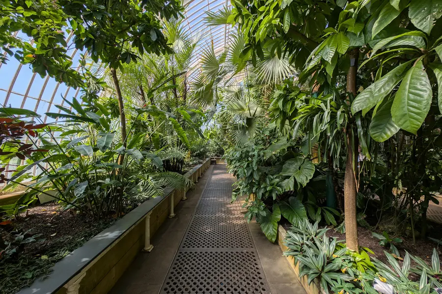
Biophilic design is the practice of bringing patterns of the natural world into architecture, interiors, and digital products: daylight, water, plants, natural materials, and spatial variety, because human beings evolved among those patterns and still respond to them.
Read it
Information architecture structures content so people can find it: choosing an organisation scheme, writing labels, building navigation and search, and testing whether the structure holds under a real task.
Read it
Sustainable design in digital work means cutting the energy and hardware a product needs: lighter pages, fewer requests, longer device life, and honest measurement of the savings.
Read it
Climate-conscious design means weighing a decision’s climate impact across materials, manufacturing, the circular economy, digital services, and communications before the decision is locked in, rather than after it ships.
Read it