
2026-09-15
Nural Choudhury
Indian design is not one visual culture but several, layered across a subcontinent where Hindu, Buddhist, Jain, Islamic and Sikh traditions have shared and contested the same regional ground for centuries.
It reads as saturated colour held in deliberate hot-and-cool contrast, a pattern that fills a surface at several scales at once, and a fixed vocabulary of figurative motifs, each carrying a specific, nameable meaning. Its nearest neighbour on the same soil, Islamic design, arrived at comparable density through geometry and calligraphy rather than through figuration and deity imagery, which is the sharpest line the two traditions draw against each other.
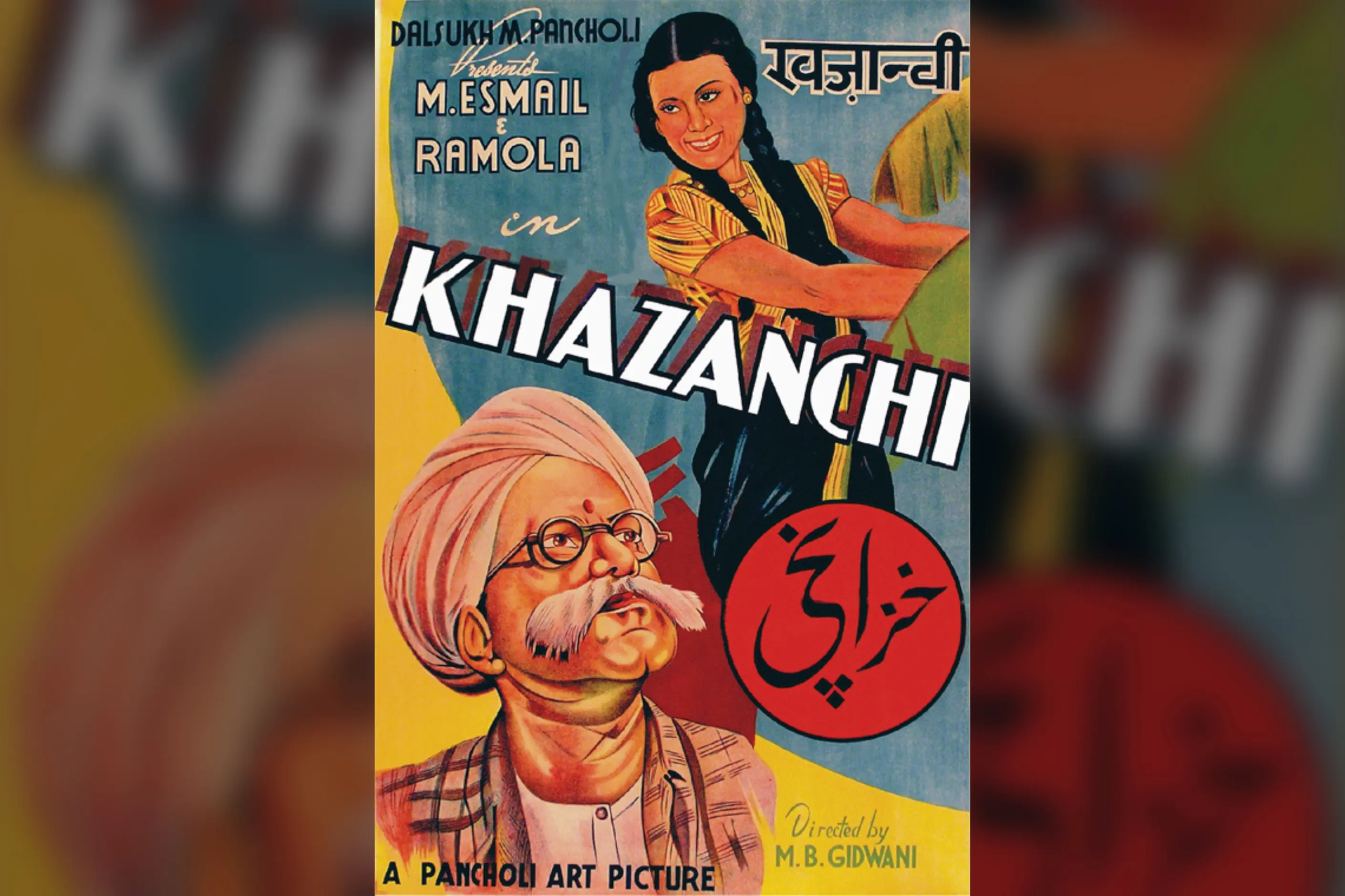
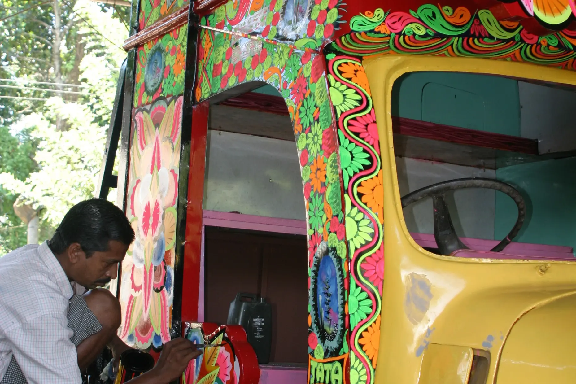
saturated colour held in deliberate hot and cool contrast, magenta against turquoise, saffron against blue, unified with gold rather than softened by it. Pattern fills the surface at several scales at once inside layered borders, with fixed figurative motifs- the lotus, the elephant, the peacock, the paisley- each carrying a specific and namable meaning rather than functioning as abstract ornament.
several millennia of continuous Hindu, Buddhist, Jain, Islamic and Sikh visual production across a subcontinent of distinct regional schools, from Rajasthani block printing to Mughal architecture to Tamil temple sculpture.
festival, celebratory and heritage-facing work that can carry saturation and symbolic density, and identity work built on a named tradition with genuine cultural consultation, never surface borrowing alone.
Indian visual production runs continuously across several millennia, from the seals of the Indus Valley civilisation to contemporary practice, and it developed as several distinct traditions occupying one subcontinent rather than as a single evolving style. Regional schools- Rajasthani, Tamil, Mughal, Bengali- differ significantly from one another while sharing certain orientations toward colour and density. These are distinct traditions and regions worth naming individually, not one subcontinental aesthetic.
Hindu aesthetics rest on named philosophical concepts. Rasa theory holds that art exists to produce one of nine emotional essences, among them love, wonder and peace, in its audience. Hindu cosmology understands the universe as a dense web of interconnection. That worldview supports an aesthetic in which ornament and fullness read as positive values rather than as clutter to edit out.
Buddhism, which originated in India before spreading across Asia, contributed the lotus as a symbol of spiritual awakening, the stupa as an architectural and decorative form, and jataka narratives, the stories of the Buddha’s past lives, as visual subject matter. Jain patrons supported a distinct manuscript-illumination tradition and ornate marble temple carving, shaped in part by the principle of non-violence (ahimsa).
Islamic traditions arrived with Muslim rulers from the eleventh century and became most influential under Mughal rule, 1526 to 1857. The Mughal court directly synthesised Persian and Indian visual language.
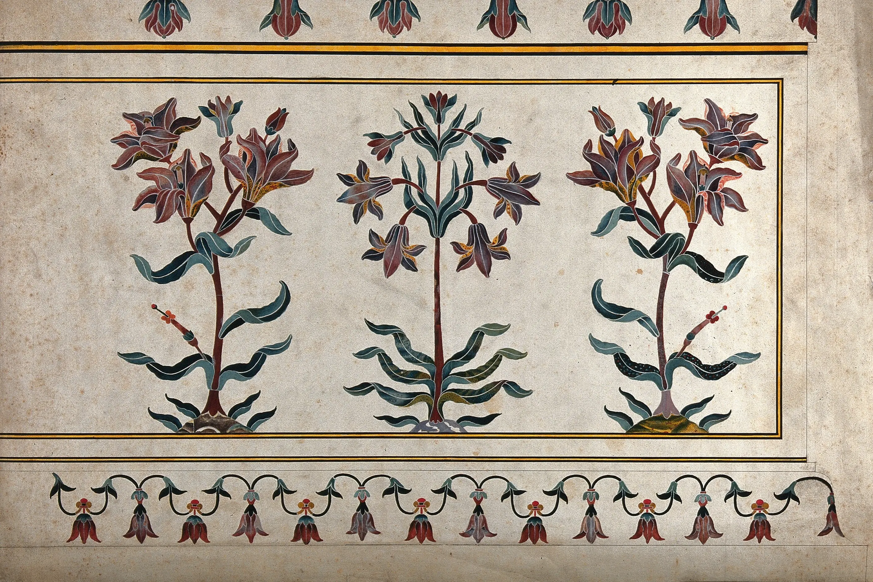
Geometric patterns merged with existing Indian decoration, Arabic and Persian calligraphy entered architecture and textiles, and the char bagh, the four-part garden representing Paradise, shaped Mughal garden and spatial design. Persian miniature painting merged with Indian styles to produce the Mughal miniature school, detailed, narrative and colourful.
Regional craft traditions carried these strands forward in distinct techniques. Rajasthani block printing, developed across centres including Jaipur, Sanganer and Bagru, produced bold floral and geometric patterns in strong colour.
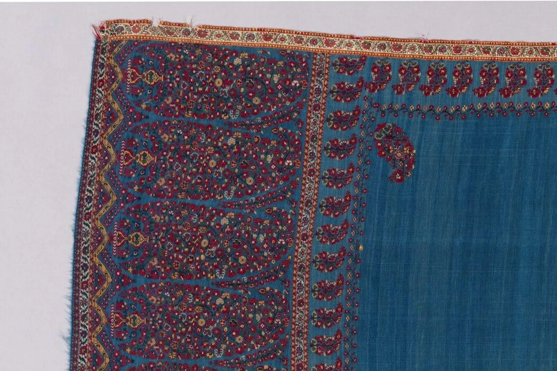
Kashmiri weavers produced fine wool paisley shawls whose motif, the boteh, reached Europe through nineteenth-century trade and shaped Western textile design. South Indian temple sculpture and Bengali terracotta panels developed their own iconographic and narrative programmes, distinct from each other and from the Mughal court tradition to the north.
| Element | What this style does | The tell |
|---|---|---|
| Colour | Uses saturated, high-contrast hue with fixed ritual association: saffron for spiritual renunciation, red for marriage and fertility, gold for divine presence, white for both purity and mourning | Hot and cool pairs sit directly adjacent, magenta against turquoise, saffron against blue, rather than separated by neutral ground, with gold used to unify the combination rather than soften it |
| Form and motif | Draws on a fixed figurative vocabulary: the lotus (padma), the elephant (gaja, associated with Ganesha), the peacock (mayura) and the paisley (boteh, derived from the mango) | Each motif carries a specific, namable meaning rather than functioning as an abstract shape |
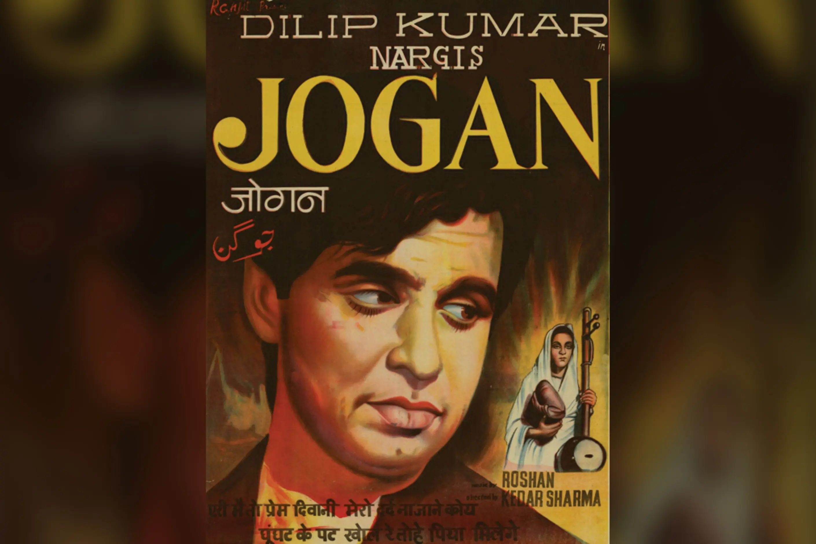
| Script and typography | Sets Devanagari, Tamil, Bengali and other Indic scripts at full weight in contemporary practice, alongside Arabic and Persian calligraphic inscription in the Indo-Islamic architectural record | Script runs as a genuine communication system rather than being shrunk to caption size or dropped in favour of Latin type alone |
| Layout and composition | Fills the surface at several scales at once, a large primary pattern, secondary elements, fine tertiary detail, inside layered, multi-band borders | Negative space is rare, and a treatment that would read as unfinished elsewhere reads as complete here |
| Materials and technique | Works in named regional technique: Rajasthani hand block printing, Mughal pietra dura stone inlay, pierced stone jali screens, Kashmiri paisley weaving | Technique is regionally specific and named, never a generic handmade texture |
| Imagery and narrative | Depicts named epics and deities directly: Ramayana and Mahabharata scenes, deity iconography, folk narrative traditions including Madhubani, Warli and Kalamkari | Imagery tells a specific story or names a specific deity, rather than standing in as generic ethnic figuration |
| Neighbour | What it shares | What separates them |
|---|---|---|
| Islamic design traditions | Both flourished on the same subcontinent, and the Mughal architectural record, the Taj Mahal’s pietra dura, its jali screens, its char bagh gardens, is where they meet directly | Islamic design works aniconically, building density through geometry and calligraphy rather than figuration. Indian Hindu, Buddhist and Jain design is built on figurative, deity-carrying motif and dense narrative ornament instead |
| Chinese design principles | Both are shaped by named philosophical and religious frameworks that govern composition, not only surface style | Chinese design principles draw restraint from specific dynastic periods and Daoist and Confucian thought, working through a comparatively limited, ink-disciplined palette. Indian design pursues saturation and multi-hue adjacency as a positive value, not a restraint to manage |
| Tessellation and pattern systems | Both rely on pattern repeated across a surface | Tessellation and pattern systems teaches the mathematical grammar of repeat and symmetry across any culture. Indian design is one cultural application of that grammar, defined by named regional technique and specific symbolic content rather than by the underlying mathematics |
Name the specific tradition and region before you draft anything. You must decide whether a brief calls for Rajasthani block-print colour, Mughal architectural inlay or South Indian temple iconography, because “Indian style” names nothing a colleague can check.
Trust saturated colour and let hot and cool pairs sit adjacent rather than separated by neutral ground. Use gold to unify a combination, not to soften it, and remember that colour associations read differently outside India, so check what a combination signals to the audience you are designing for.
Where a brief wants pattern density, layer at least two scales and frame the result with a border, since a single flat pattern reads as thin rather than abundant in this tradition. Treat sparse negative space as a deliberate softening decision, never a default, and reserve it for interfaces that must carry dense data, where the tradition’s own layered density will reduce legibility.
Research a motif’s meaning before you use it. The lotus, the elephant, the peacock and the paisley each carry a specific association, and using one for its surface shape while ignoring its meaning is the shortest route to pastiche.
Set Indic script at full communicative weight where an identity genuinely calls for it, and commission a type designer fluent in that script rather than approximating letterforms your team cannot read. Reserve sacred and ritual forms, deity iconography, the Om syllable, kolam and rangoli floor patterns, for contexts that warrant them, or leave them out.
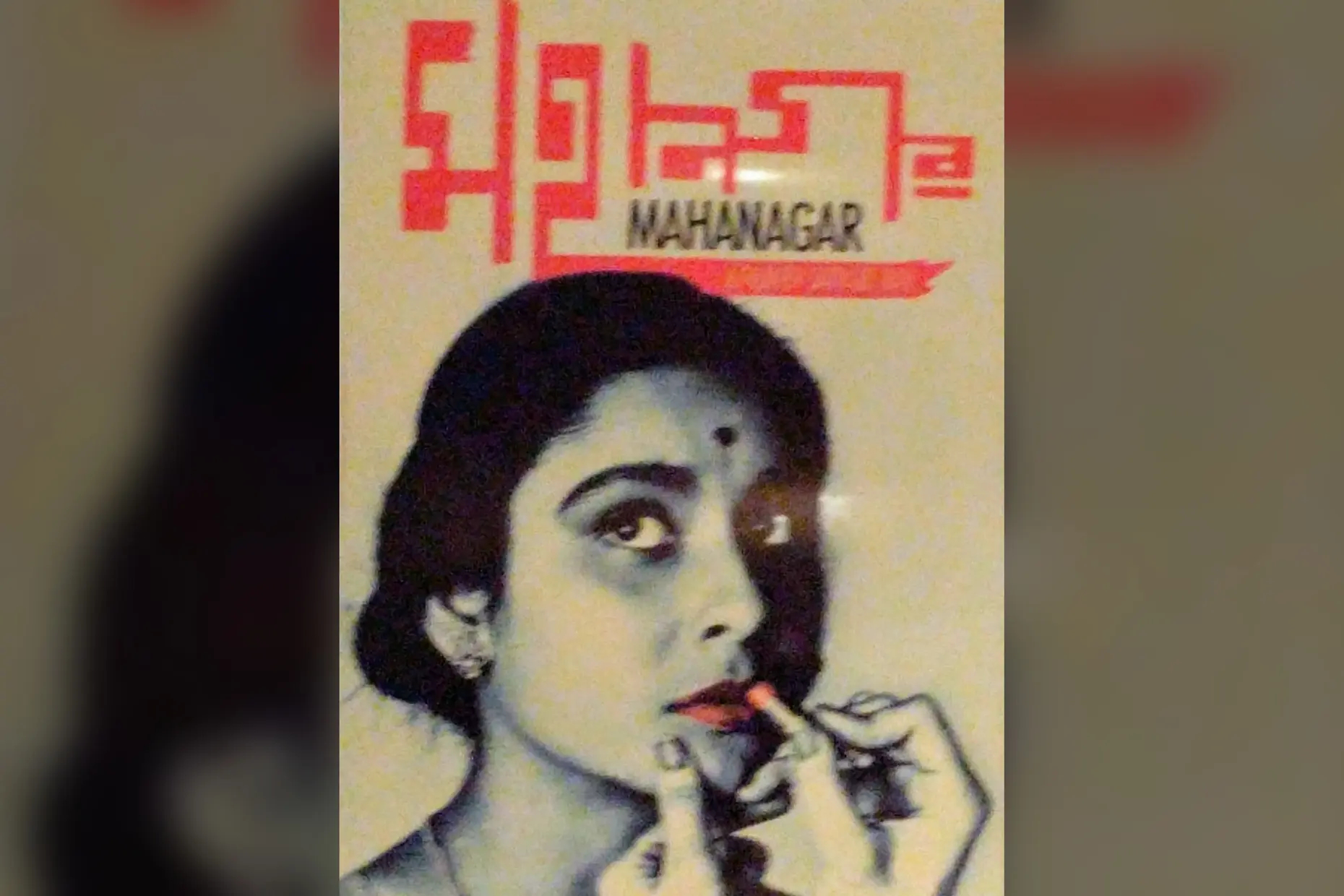
The most common failure flattens the subcontinent into a single generic “ethnic” look: a wash of saffron, paisley, and the Om symbol with no named region, no named tradition, and no distinction between Hindu, Buddhist, Jain, Sikh, or Islamic sources. That flattening erases real differences between traditions, and it is also inaccurate.
Contemporary Indian design also carries a real, unresolved tension over its own colonial inheritance. Western design education and professional standards arrived in India through colonial rule, and contemporary designers still negotiate a relationship with inherited technique and training that did not originate on their own ground.
Appropriation belongs here stated directly, not gestured at. Sacred and ritual forms carry active religious meaning for the communities that hold them, and they are not free to borrow decoratively. Deity imagery, the Om syllable and kolam and rangoli floor patterns are examples: lifting any of them as generic decorative texture substitutes borrowed weight for meaning the borrower has not earned.
The swastika is the clearest case in this tradition. It is an ancient Indian symbol of auspiciousness, historically distinct from and predating its twentieth-century Nazi appropriation, and using it decoratively without that context invites confusion and offence a designer working from the tradition would avoid.
A reference names the specific tradition a motif comes from and uses it for the meaning it carries in context. A costume lifts the surface pattern and discards the meaning entirely.
Away from appropriation, the style fails in more ordinary ways too. Maximal pattern density applied to a data-dense interface reduces legibility rather than adding richness, and the tradition’s own logic says as much: density suits celebration and cultural expression better than it suits a form a user has to read quickly under pressure.
No, the subcontinent holds several distinct religious and regional traditions, Hindu, Buddhist, Jain, Islamic and Sikh among them, each with its own regional schools such as Rajasthani, Tamil, Mughal and Bengali work. Treat “Indian design” as a family of related traditions, not one look.
How does Indian design relate to Islamic design within the same country? They meet directly in the Mughal architectural record; the Taj Mahal’s pietra dura and jali screens are among the clearest examples, but they work by different means. Islamic tradition builds density through geometry and calligraphy without figuration, while Hindu, Buddhist and Jain design builds it through figurative, deity-carrying motifs.
Can I use the Om symbol or a deity image in commercial work? Only where the brief has a genuine warrant and, ideally, informed cultural consultation. These are sacred forms with a living owner, and using them as generic decorative texture is appropriation, not a grey area.
What does the term horror vacui miss when applied to Indian pattern? The term frames filled surfaces as a fear of emptiness, which imposes a Western reading on a tradition that treats fullness as a positive value connected to cosmic interconnection, not an anxiety to overcome. Describe the density as a deliberate value rather than an absence of restraint.
Which contemporary designers carry these traditions forward? Fashion designers including Sabyasachi Mukherjee, Manish Malhotra and Ritu Kumar bring specific regional textile and embroidery traditions into international visibility, and their commercial success also funds the craft skills, block printing, weaving, and embroidery that might otherwise disappear.
| Fact | Detail |
|---|---|
| Named religious traditions | Hindu, Buddhist, Jain, Islamic and Sikh, each with a distinct visual vocabulary on the same subcontinent |
| Mughal rule | 1526 to 1857, the period of deepest Indo-Islamic architectural and decorative synthesis |
| Islamic arrival | With Muslim rulers from the eleventh century |
| Defining Mughal building | The Taj Mahal, exemplifying pietra dura stone inlay |
| Rajasthani block-printing centres | Jaipur, Sanganer, Bagru |
| Paisley’s origin route | Kashmiri wool shawls, exported to Europe in the nineteenth century as the boteh motif |
| Named folk painting traditions | Madhubani, Warli, Kalamkari |
| Mythological narrative sources | The Ramayana and the Mahabharata |
| Contemporary comics adapting mythology | Amar Chitra Katha |
| Named contemporary fashion designers | Sabyasachi Mukherjee, Manish Malhotra, Ritu Kumar |
| Contemporary Indic typefaces cover | Devanagari, Tamil, Bengali and other Indic scripts |

Islamic design traditions are interlinked visual systems (geometric patterns, calligraphy, and arabesques) that developed over fourteen centuries and across three continents, from Spain to Indonesia.
Read it
Chinese design principles are the visual and spatial conventions developed across successive dynasties of Chinese civilisation, from Bronze Age ritual bronzes through the fall of the Qing dynasty in 1912 and into contemporary China’s design industry.
Read it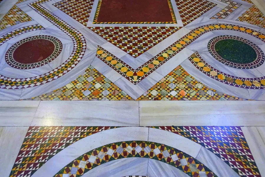
Tessellation is the covering of a plane with shapes that meet edge to edge, with no gaps and no overlaps, and it follows a small, provable set of mathematical rules rather than taste.
Read it
Sacred geometry treats certain geometric forms and proportions, among them the golden ratio, the Platonic solids, and the Flower of Life, as evidence of a divine or cosmic order laid over mathematics that is otherwise plain and checkable.
Read it
Calligraphy is the practice of beautiful handwriting: letters formed in one continuous, tool-determined stroke rather than built up through repeated passes.
Read it
Colour theory is the study of how colours relate to each other on the wheel, across value, saturation, and temperature, and in combination so that you can reason through a decision rather than feel it.
Read it