
2026-09-15
Nural Choudhury
Utilitarian design justifies every visual decision by function alone: colour, form, material and ornament exist only where they serve a task, a safety requirement or comprehension.
It is not a period style with a founding date but a working discipline, visible wherever the Shaker furniture-making tradition and military specification design left their mark, from tools to safety systems to industrial interiors. Minimalism removes elements for aesthetic effect; utilitarian design removes them because they cannot justify their presence, so ornament is not forbidden here; it is unearned.
spare forms with no unclaimed decoration, type sized and weighted for legibility over character, colour used only to code information such as red for danger or green for success, materials shown as what they are rather than dressed to look costlier, and a layout sequenced to match the order a task happens in.
the reasoning traces to the Shaker furniture-making tradition, which treated unnecessary ornament as a moral failing, and to military specification design, which derives appearance from operational requirements rather than a style sheet.
professional tools, technical documentation, safety and emergency systems, industrial and infrastructure environments, and administrative interfaces built for trained, repeat users.
Utilitarian design has no single founding movement or date. It accumulates wherever a field prioritises operation over expression, so its history is a set of recurring threads rather than a school.
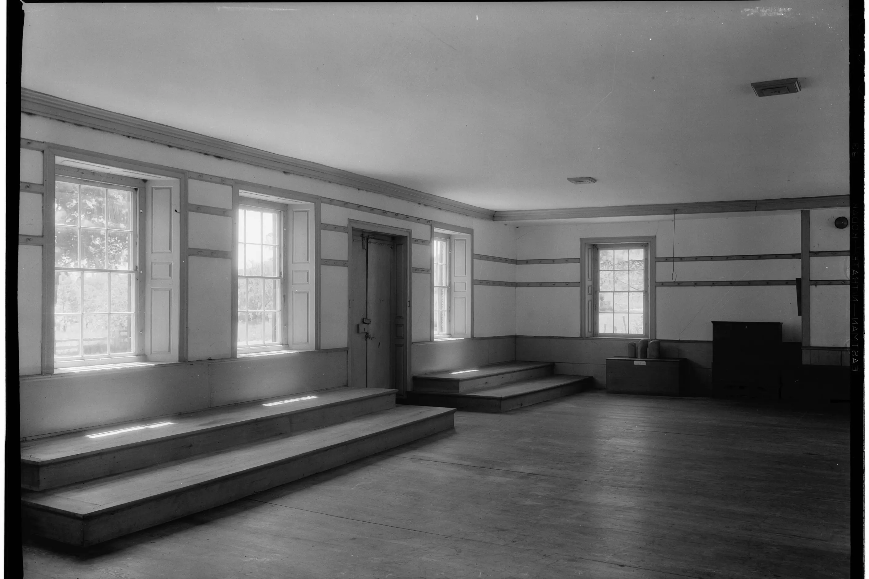
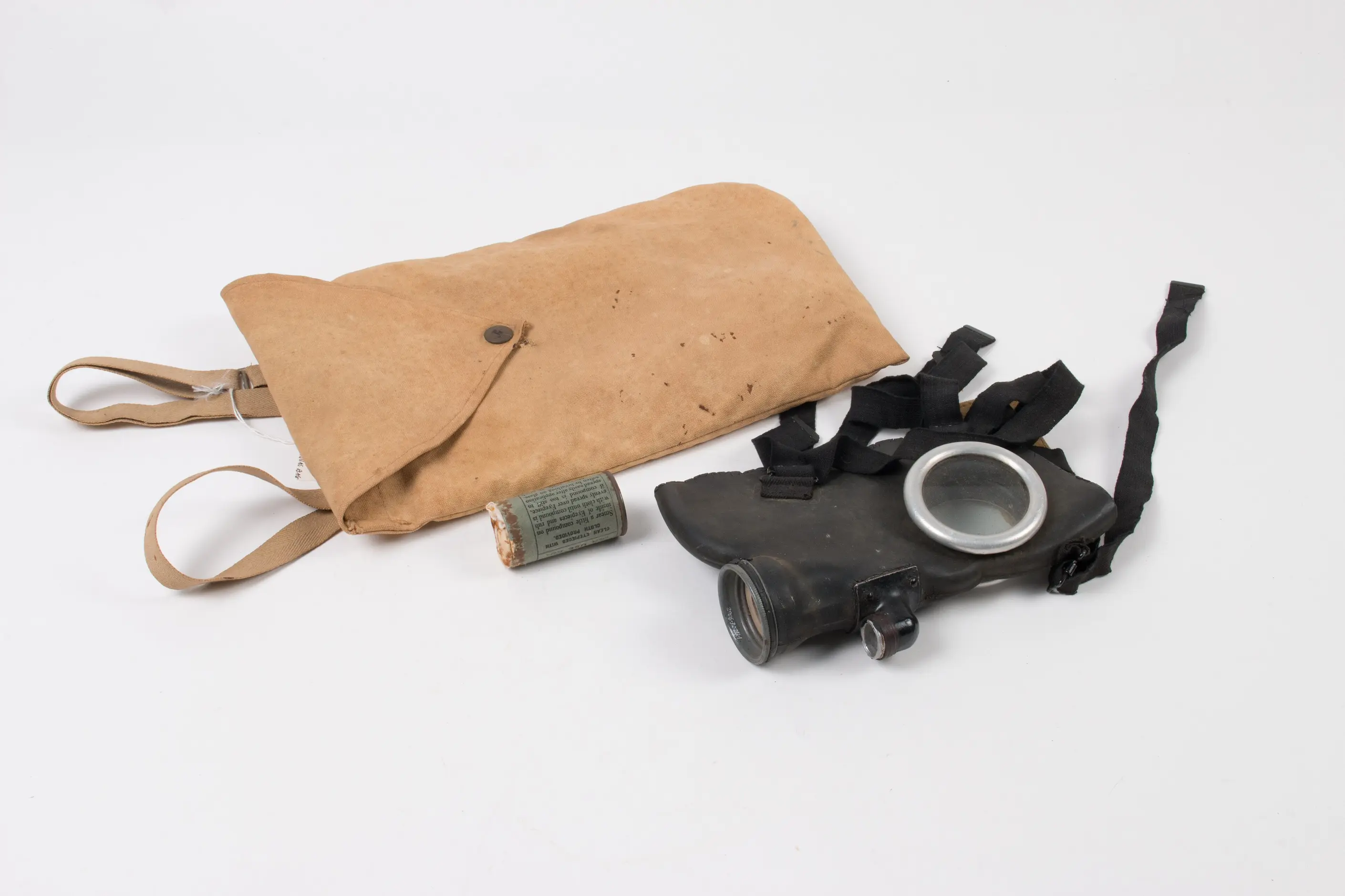
The Shaker furniture-making tradition supplies one thread. Shaker communities held that unnecessary ornament was a moral error, and the plain forms of Shaker chairs and cabinets are not a style choice but the consequence of applying that belief consistently: what remained was what function required. Military specification design supplies the second thread. Equipment is specified by what it must do, and the resulting colour, form and material follow from the requirement rather than from a design brief; the aesthetic is a residue of the specification, not a pursuit of it.
Twentieth-century administrative, industrial and safety design inherited this reasoning wherever the stakes of getting it wrong were physical, or fell on an untrained public under pressure. What remains in every case is the same kind of leftover: whatever survives once everything that cannot justify itself has already been cut, and it is this residue, not a preference for austerity, that a reader is learning to recognise.

| Element | What this style does | The tell |
|---|---|---|
| Colour | Assigns each colour a fixed meaning (danger, success, warning, information) and holds a neutral palette everywhere else | A colour vocabulary you can interrogate: ask what a colour communicates and it has an answer |
| Form and shape | Follows use: grip, aperture, mounting point, structural load | Geometry that looks under-designed because nothing exists beyond the requirement |
| Typography | Legibility-first faces, sized for real viewing conditions, clear numerals | Hierarchy built from size and weight alone, never from a display face or a flourish |
| Layout and composition | Sequences elements in the order a task happens, not for visual balance | The most important action or fact is the most visible element, without exception |
| Materials and texture | Materials read as what they are, and wear is visible rather than concealed | Nothing imitates a costlier material; steel is used because it is strong, not because it signals industry |
| Imagery and ornament | Present only where it carries information, such as a recognition icon or a colour-coded diagram | Every mark earns its place by making a task faster or an error less likely |

| Neighbour | What it shares | What separates them |
|---|---|---|
| Minimalism in design | Sparse forms and a taste for restraint | Minimalism removes elements for aesthetic effect, and can remove function to get there. Utilitarian design removes only what fails a functional test, and adds an element back the moment function requires it |
| Brutalist graphic design | A refusal of applied decoration and a taste for visible structure | Brutalist graphic design deliberately unsettles the viewer as a statement. Utilitarian design never courts discomfort: plainness is a byproduct of function, and user hostility is a defect to fix, not an effect to pursue |
| Swiss design | Grid discipline and legibility as shared goals | Swiss design is a typographic and compositional programme built on objectivity as an aesthetic ideal. Utilitarian design has no compositional programme at all; its layout is a byproduct of task sequence, not a grid pursued for its own sake |
Start with a functional audit before a single design decision. List what the object, interface or document must do, then test every candidate element against that list, and cut any decoration that has no functional answer.
Define the colour vocabulary before you use colour. Fix what each colour communicates, such as danger, success, warning or information, and hold to it across the whole system rather than spending the same colour on decoration elsewhere.
Sequence layout to the task, not to composition. Order elements the way a user needs them in use, and put the most important action or fact where it cannot be missed.
Choose typefaces and materials for legibility and honesty, not association. A typeface must read clearly under actual use conditions, and a material must be what it appears to be.
Include human wellbeing in the functional requirement, not as decoration on top of it. If people spend time with the result, their comfort and dignity are part of what it must do.
Treat pastiche as a risk at every step. The utilitarian look signals seriousness, so people borrow it when they want the signal without the reasoning behind it. If a choice cannot be justified against the functional list, it is affectation, however plain it looks.
Pseudo-utilitarianism is the most common failure: an industrial or austere look applied to a consumer product or brand context that never needed it, because the aesthetic signals seriousness even where the functional reasoning behind it is absent. Users sense the disconnect even when they cannot name it.
Hostile environments follow from defining function too narrowly, as pure task completion with no regard for how people feel while completing it. The result works technically and is miserable to use, which is a functional failure once human wellbeing is counted as part of the function.
Applied outside its context, utilitarian design produces objects and spaces nobody chooses to love, because consumer products, public spaces and daily-use objects often depend on delight and emotional resonance that a purely functional brief cannot supply.
Reduction can also fail on its own terms. Stripping an interface or a document past the point where users can still complete the task turns minimal into confusing, and the fix is restoring the specific element that made comprehension possible, not adding decoration.
Because utilitarian design is conservative by nature, it also tends to fossilise. A system built for a previous generation of tasks keeps its old form even after the task has changed, so it needs a repeated functional audit, not a one-off. A documentation set written for a product with ten features does not automatically still serve one with a hundred.
Is utilitarian design the same as minimalism?: No. Minimalism is an aesthetic choice that can be applied for effect, including at the cost of function. Utilitarian design is a reasoning process: it removes what fails a functional justification test, and it will reintroduce a warning colour or a redundant control the moment function demands it.
Can utilitarian design use colour or ornament at all? Yes, where the colour or mark carries information rather than visual interest. A colour-coded warning or a recognition icon is functional; the same colour used purely for decoration in the same system is not.
Where should I avoid utilitarian design? Consumer products, public spaces and daily-use or personal objects, where experience, emotional resonance and brand expression genuinely matter and a purely functional brief cannot supply them.
Does utilitarian design ever innovate? Yes, but innovation must justify itself functionally. A new approach must be meaningfully better at the task, not merely different, because standards reduce error and enable scale in a way novelty does not.
What is the biggest risk in trying to imitate the style? Pseudo-utilitarianism, where the austere look is copied for the seriousness it signals without the functional reasoning that is supposed to produce it. The result is form without the substance it is pretending to carry.
| Field | Detail |
|---|---|
| Origin threads | The Shaker furniture-making tradition and twentieth-century military specification design |
| Organising question | What does this need to do? |
| Best fits | Professional tools, technical documentation, safety and emergency systems, industrial and infrastructure environments, administrative interfaces |
| Avoid for | Consumer products, public spaces, brand expression, daily-use and personal objects |
| Closest neighbours | Minimalism in design, Brutalist graphic design, Swiss design |
| Defining test | Functional justification: every element must answer why it exists in terms of task, feedback, error prevention, safety or maintenance |
| Common failure | Pseudo-utilitarianism, the austere look adopted without the functional reasoning behind it |

Minimalism in design reduces a composition to the elements it cannot function without, so colour, form, type, and space each carry more weight because there is less to look at.
Read it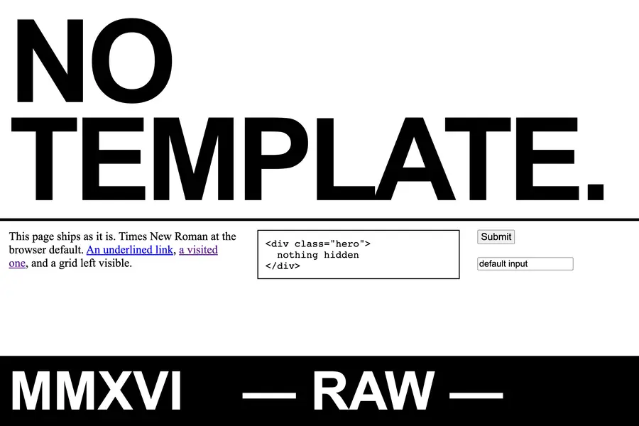
Brutalist graphic design is a raw, deliberately unpolished visual style in web and editorial design, built from system fonts, oversized type and exposed structure to reject the smooth optimisation of mainstream digital design.
Read it
Swiss Design, more precisely the International Typographic Style, is a graphic design programme built on the mathematical grid: a single sans-serif typeface, asymmetric layout and photography treated as documentary fact, formalised in Zurich and Basel through the 1950s.
Read it
Colour management is the discipline of specifying a colour precisely enough that a printer, a signage vendor and a web team can all reproduce it the same way, then documenting that specification.
Read it
Typography is the craft of shaping and spacing type so readers can recognise its letters and follow its meaning without friction.
Read it
Layout is the arrangement of elements inside a frame: what a viewer sees first, second, and third, and what the space between things does as they look.
Read it
Digital accessibility is the practice of building products people can use, whatever their permanent, temporary, or situational disability, measured against a published standard rather than opinion.
Read it